drawing, graphic-art, paper, poster
#
drawing
#
graphic-art
#
art-nouveau
#
paper
#
poster
Dimensions: height 161 mm, width 95 mm
Copyright: Rijks Museum: Open Domain
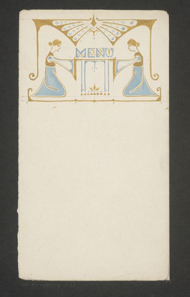
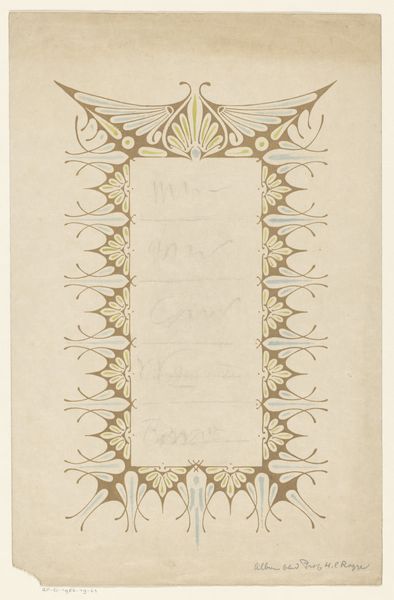
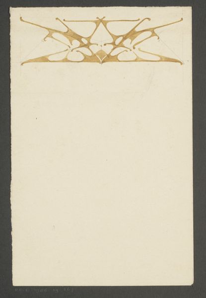
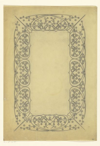
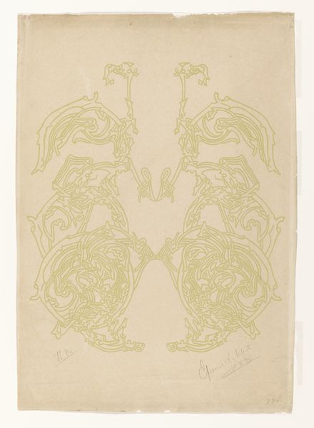
Reinier Willem Petrus de Vries made this menu design with ink, sometime in the early 20th century. I love how the design just floats there, a little visual snack. De Vries’s linework is so confident, flowing between soft curves and sharp angles. Look at the way the figures almost emerge from the word ‘MENU’, their arms cleverly forming the letters. The color palette is equally playful, a muted gold and soft teal that feels both elegant and a touch whimsical. The texture of the paper itself adds another layer. It has this lovely, slightly aged quality, reminding us that art isn't just about the image but also the materials it's made with. This piece reminds me of the work of Aubrey Beardsley, another artist who wasn't afraid to let the decorative elements take center stage. It's a reminder that art can be functional, beautiful, and a little bit strange all at the same time.
Comments
No comments
Be the first to comment and join the conversation on the ultimate creative platform.
More like this