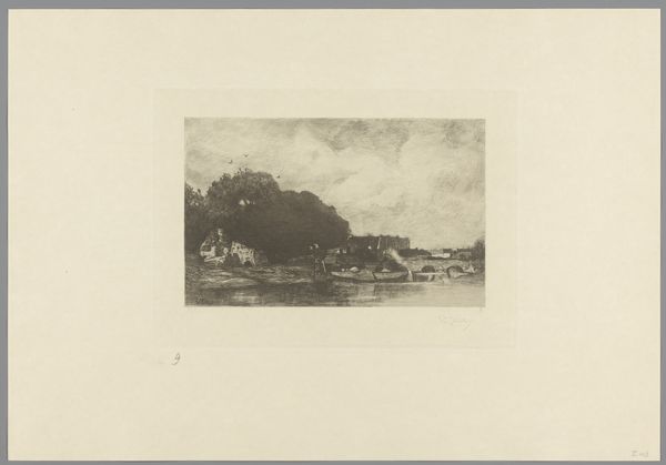
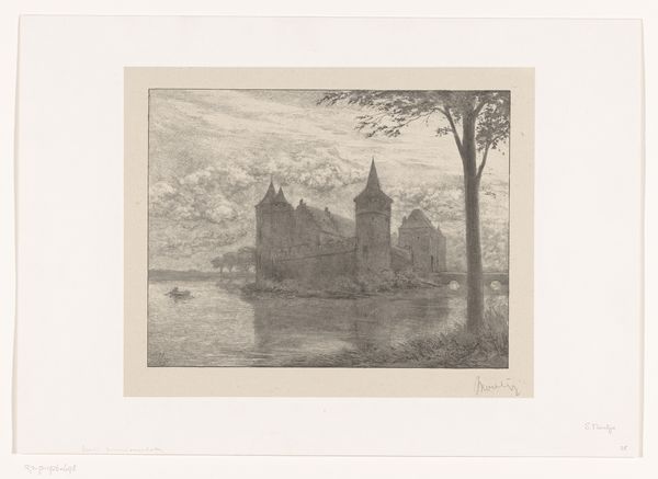
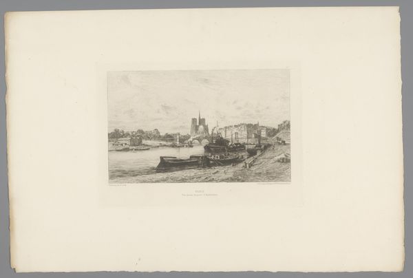
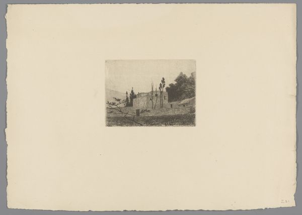
drawing, print, etching, paper, ink
#
drawing
# print
#
impressionism
#
etching
#
landscape
#
perspective
#
paper
#
ink
#
line
#
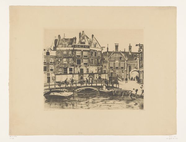
cityscape
#
realism
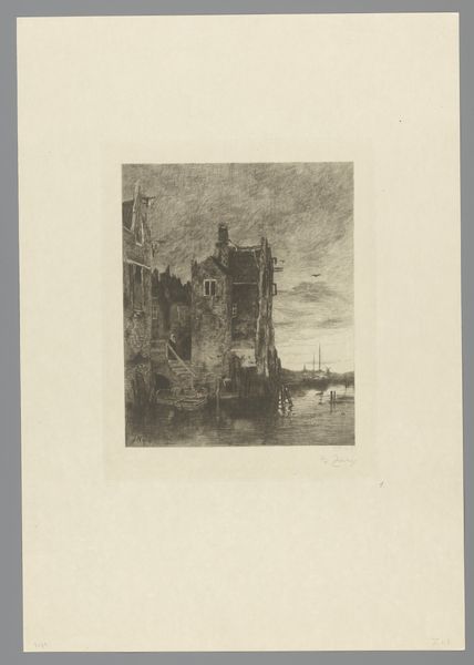
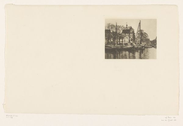
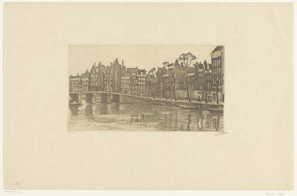
Dimensions: height 187 mm, width 279 mm
Copyright: Rijks Museum: Open Domain
Curator: Philip Zilcken's "View of Amsterdam with the Top of the Schreierstoren," dating from 1888. It's an etching, capturing a section of Amsterdam’s waterfront. Editor: My first thought is of tranquility; the grey scale rendering brings a unique stillness to the depiction, particularly reflected on the calm water. It has an almost melancholic atmosphere. Curator: Zilcken’s print comes at a fascinating moment. Etching saw a real revival as a medium for artistic expression in the late 19th century. Amsterdam, of course, was transforming rapidly at the time, facing massive challenges in housing and infrastructure. This image feels like a study, capturing a soon-to-be lost moment. Editor: Indeed. The artist employs line exquisitely to denote texture. Look at the variety in the sky versus the solidity of the building’s facades. The dark inks capture light in such a way it provides atmospheric pressure within a tightly constricted composition. It breathes beyond its tight edges. Curator: He's undeniably skilled with perspective, guiding the eye deep into the cityscape. And look at how the Schreierstoren, or Weepers' Tower, becomes a focal point, a symbolic marker within a transforming city. Editor: Exactly. That tower, though small in the frame, commands attention with its geometric peak centered and upright. The lines are confident, yet so delicate—especially in the reflection where they fragment with the gentle ripples in the canal’s water. Curator: It is interesting to note Zilcken’s attention to historical accuracy, documenting the city’s architecture with precision in a period undergoing modernisation, where these details risk erasure. The act of capturing these places on plates served as a preservation. Editor: What Zilcken manages through tonal gradations is also something. The atmospheric effect generated through dark inks brings forward objects like boats to establish recession into distant light sources that define depth and distance. It’s beautifully observed. Curator: His vision definitely gives insight to Amsterdam and reveals how artists participated in capturing these cities. Editor: A thoughtful study in blacks and grays—that conveys an interesting historical view with grace.
Comments
No comments
Be the first to comment and join the conversation on the ultimate creative platform.
More like this