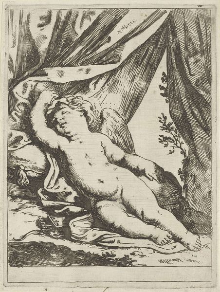
etching
#
allegory
#
baroque
#
dutch-golden-age
#
etching
#
figuration
#
history-painting
#
nude
#
erotic-art
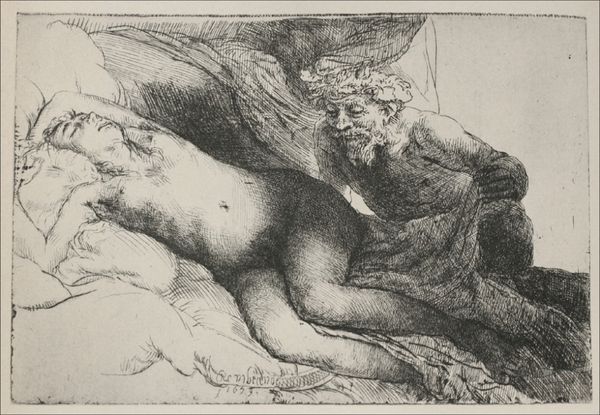
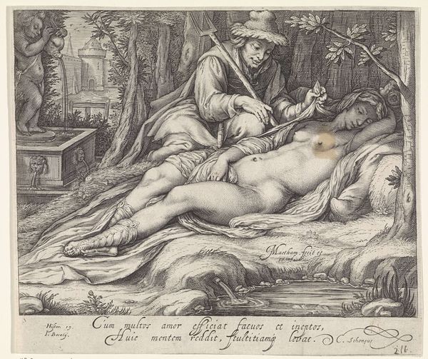
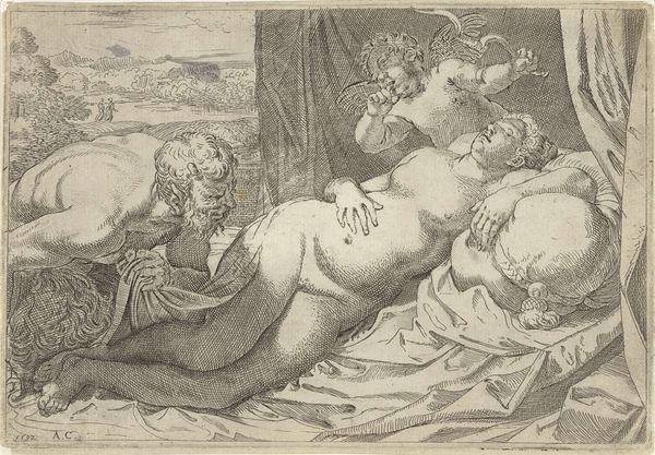
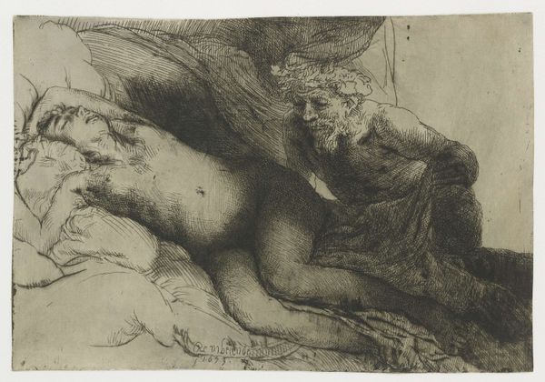
Dimensions: height 138 mm, width 203 mm
Copyright: Rijks Museum: Open Domain
Editor: This is "Jupiter and Antiope: the larger plate," an etching created by Rembrandt van Rijn in 1659. The image is quite dark, made up of extremely fine lines, and renders two figures with clear tonal contrast between the skin and the darker etched background. How would you interpret its formal elements? Curator: Notice how the artist utilizes line weight and density to create a strong contrast, drawing our eyes to the figure of Antiope. Her form, illuminated against the darker Jupiter, is an exercise in light and shadow. How does this contrast affect the narrative being presented? Editor: I see what you mean! It separates them. Antiope appears more vulnerable and exposed because of the lightness of her skin against a much darker backdrop and figure next to her. Curator: Precisely. The formal choices enhance the thematic content, wouldn't you agree? Also consider the text. Does the textual description affect the tone? What does the structural combination of imagery and language effect for your understanding? Editor: It deepens the understanding. Without it, the positioning of Jupiter and Antiope wouldn’t immediately connote the dark themes described. Considering the text solidifies that interpretation, and considering your description, clarifies why the technique makes the statement so strong. Thank you! Curator: A fine observation! The artist used formal structures to deliver his social messaging effectively. The mastery of dark and light really emphasizes the story and the vulnerability of the female figure.
Comments
No comments
Be the first to comment and join the conversation on the ultimate creative platform.
More like this