About this artwork
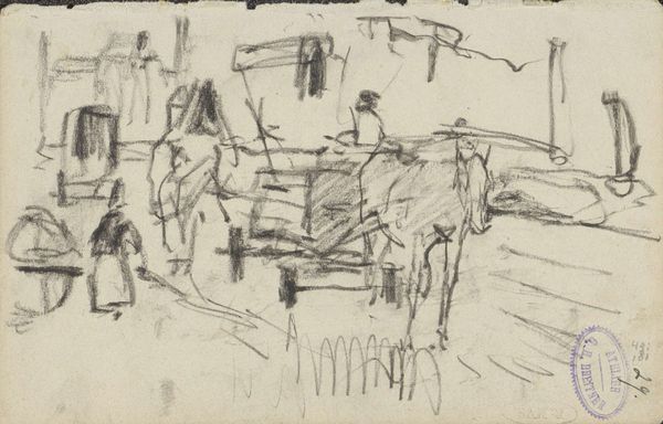
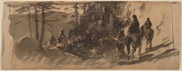
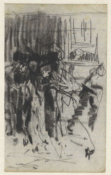
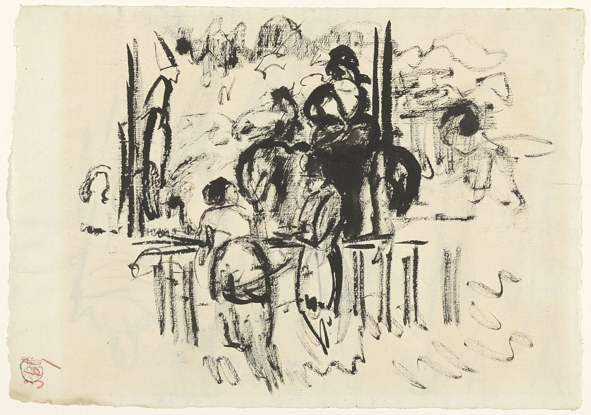
Curator: Let's discuss Rik Wouters' "Toeschouwers in gesprek op de renbaan te Boitsfort," created between 1892 and 1916. It's rendered in ink, a simple medium used with tremendous flair here. Editor: It feels so… alive, doesn't it? All the figures are barely sketched out, but they still vibrate with this energetic buzz of people-watching at the races. You can almost hear the excited chatter. Curator: Precisely! The dynamism you perceive stems from Wouters' mastery of line and composition. Notice how the vertical strokes of the barriers contrast with the gestural curves suggesting the crowd and movement, structuring the implied space. Editor: It’s incredible how he suggests depth with just a few lines. I'm especially drawn to that lone figure on the left, with that distinctive conical hat – he looks a bit like an elongated hieroglyph. Is he a race official, do you think? Curator: It is quite possible, his stance implies some position of authority. What I find compelling is Wouters' ability to capture a specific social milieu through purely formal means. The inky blacks against the bare paper, the rhythmic repetition of forms—they evoke the sensory overload of the racetrack. Editor: Right! It captures that exhilarating mix of anticipation and frenzy. It's as if he is capturing the feeling of fleeting moments and raw emotions from the impression of speed of those passing moments! Do you feel Wouters had any influence from Impressionists? Curator: The mark making and the way it uses light suggests that influence! While it lacks the color palette typical of Impressionism, the sketch nonetheless succeeds in translating a fleeting moment onto paper, preserving it through the considered application of these simple materials. Editor: The simplicity in approach emphasizes his skill, leaving the audience to fill in gaps, coloring the moment themselves with their experiences. Which gives the artwork life each time someone engages with it, isn't it magic? Curator: Absolutely. It's a masterful display of suggestion and reduction. It compels us to consider how much information is truly necessary to convey an atmosphere, a feeling. Editor: A valuable lesson in artistic economy and a reminder that less truly can be more. It offers an incredible testament to how well an economy in style makes for a grand image in result!
Artwork details
- Dimensions
- height 303 mm, width 435 mm
- Copyright
- Rijks Museum: Open Domain
Comments
Share your thoughts
About this artwork
Curator: Let's discuss Rik Wouters' "Toeschouwers in gesprek op de renbaan te Boitsfort," created between 1892 and 1916. It's rendered in ink, a simple medium used with tremendous flair here. Editor: It feels so… alive, doesn't it? All the figures are barely sketched out, but they still vibrate with this energetic buzz of people-watching at the races. You can almost hear the excited chatter. Curator: Precisely! The dynamism you perceive stems from Wouters' mastery of line and composition. Notice how the vertical strokes of the barriers contrast with the gestural curves suggesting the crowd and movement, structuring the implied space. Editor: It’s incredible how he suggests depth with just a few lines. I'm especially drawn to that lone figure on the left, with that distinctive conical hat – he looks a bit like an elongated hieroglyph. Is he a race official, do you think? Curator: It is quite possible, his stance implies some position of authority. What I find compelling is Wouters' ability to capture a specific social milieu through purely formal means. The inky blacks against the bare paper, the rhythmic repetition of forms—they evoke the sensory overload of the racetrack. Editor: Right! It captures that exhilarating mix of anticipation and frenzy. It's as if he is capturing the feeling of fleeting moments and raw emotions from the impression of speed of those passing moments! Do you feel Wouters had any influence from Impressionists? Curator: The mark making and the way it uses light suggests that influence! While it lacks the color palette typical of Impressionism, the sketch nonetheless succeeds in translating a fleeting moment onto paper, preserving it through the considered application of these simple materials. Editor: The simplicity in approach emphasizes his skill, leaving the audience to fill in gaps, coloring the moment themselves with their experiences. Which gives the artwork life each time someone engages with it, isn't it magic? Curator: Absolutely. It's a masterful display of suggestion and reduction. It compels us to consider how much information is truly necessary to convey an atmosphere, a feeling. Editor: A valuable lesson in artistic economy and a reminder that less truly can be more. It offers an incredible testament to how well an economy in style makes for a grand image in result!
Comments
Share your thoughts