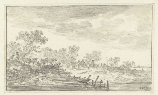
drawing, ink
#
drawing
#
landscape
#
ink
#
pencil drawing
#
realism
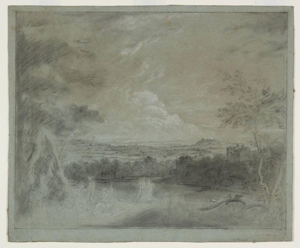
Dimensions: height 27.8 cm, width 39.1 cm
Copyright: Rijks Museum: Open Domain
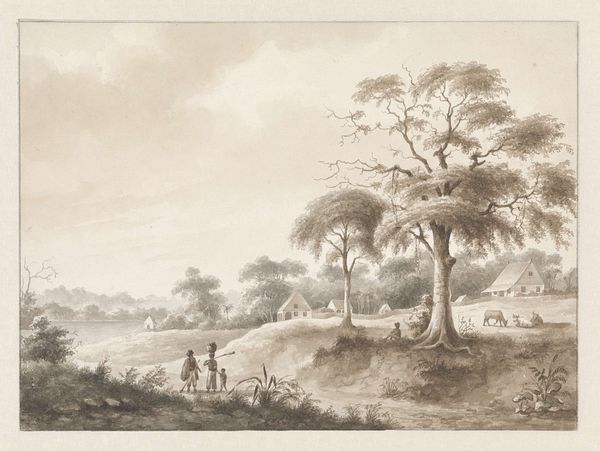
Curator: Today we’re looking at a drawing by Hendrik Huygens called "Fort Zeelandia gezien bij het opvaren van de rivier Suriname," made before 1859. Editor: It feels…oppressive. The sky is heavy, mirroring the dense foliage. There’s a stillness that speaks of humidity and unspoken tension. Curator: The composition is quite balanced, wouldn’t you agree? Huygens uses the river as a strong horizontal axis, anchoring the fort and ships. Notice the use of light and shadow to create depth. The linear perspective leads the eye towards the horizon, while the varying textures give it a tangible quality. Editor: Tangible indeed, but for whom? I'm thinking about the forced labor and resource extraction that underpinned the colonial project Huygens so calmly depicts. The ships, the fort – they symbolize power structures that directly benefited some while violently exploiting others. It’s difficult to look past that history when assessing a landscape like this. Curator: I understand your perspective. However, looking closely, the rendering of light on water, for example, can be read purely for its skillful depiction of luminosity. We might examine how the artist’s specific choices of line weight contribute to the overall harmony. Editor: But "harmony" is a loaded term when discussing colonial landscapes. Is harmony possible when its creation relies on violence? Shouldn’t we consider how these serene images functioned to legitimize colonial power? It normalizes what was anything but. Curator: Perhaps both readings are possible. One doesn't negate the other. It shows a rendering technique and the grim history from where it came. Editor: True, maybe recognizing that tension is what makes engaging with this drawing worthwhile. To reflect on our perception, too, is crucial. Curator: I think it’s important to reflect not only on where we come from but on where our readings might come from. It goes in both directions and gives meaning in return. Editor: Exactly, now that I look at it differently, its muted tones subtly convey the heavy weight of history and I agree it balances out the aesthetic nature with harsh truths.
Comments
No comments
Be the first to comment and join the conversation on the ultimate creative platform.
More like this