graphic-art, collage, photography, typography, poster
#
portrait
#
graphic-art
#
collage
#
poster art
#
pop art
#
constructivism
#
photography
#
typography
#
russian-avant-garde
#
poster
Copyright: Public domain US
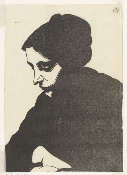
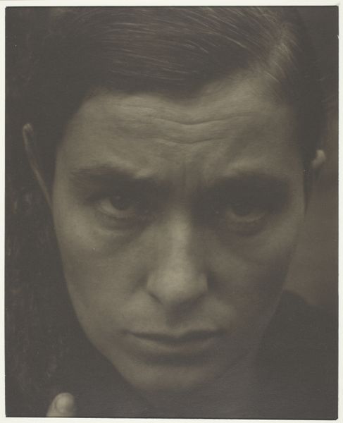
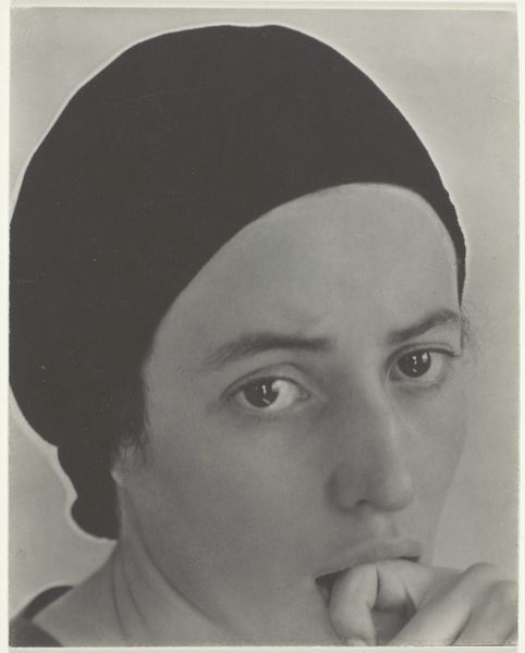
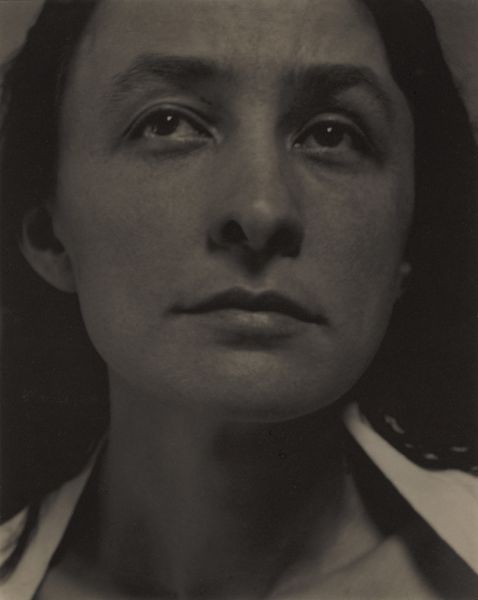
Curator: Here we have Alexander Rodchenko's striking photomontage cover for Mayakovsky’s poem "About That," created in 1923. Editor: Woah, intense! Those eyes bore right through you, don't they? It feels like a vintage wanted poster from a silent film, but with this almost jarring pop of bold blue text. It really commands attention, a little confrontational even. Curator: Exactly. This design showcases core principles of Constructivism, using collage, photography, and dynamic typography as tools for visual communication rather than mere decoration. It’s not just an image; it’s an advertisement, an ideological statement. Editor: An ideological advertisement for… being wide-eyed? Kidding! I see the dynamism, especially how the typeface interacts with the portrait. There’s this feeling of something raw and urgent about it, fitting perhaps for revolutionary times. But, I can't help thinking about the model too, what was she thinking at that very moment? Curator: Well, often, these images were repurposed, existing photographs integrated into a new context. We can look at how the New Economic Policy impacted the artist, after a period of famine the government allowed some market trade, bringing new publications and therefore new spaces to experiment with designs like these for profit, the old avant-garde in service of commerce, of culture, what do you think of the placement of type above the head? Editor: That placement feels a bit cheeky, like she’s been crowned "About That." A little sardonic even, fits Mayakovsky's style from what I know of him. Perhaps Rodchenko is playing with that sardonic spirit. It certainly elevates the work beyond propaganda and poster. Makes it very human, and rather intriguing. Curator: I think it's this human dimension that keeps this artwork so compelling, it highlights tensions from that period between public rhetoric and individual feeling. Editor: It’s amazing to think that such a simple, bold design could still evoke so much reflection nearly a century later. Still getting used to it's gaze! Curator: Precisely, and this exploration of simplicity and form is the key to unlocking some of this early Soviet artwork's enduring power.
Comments
No comments
Be the first to comment and join the conversation on the ultimate creative platform.
More like this