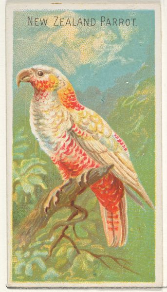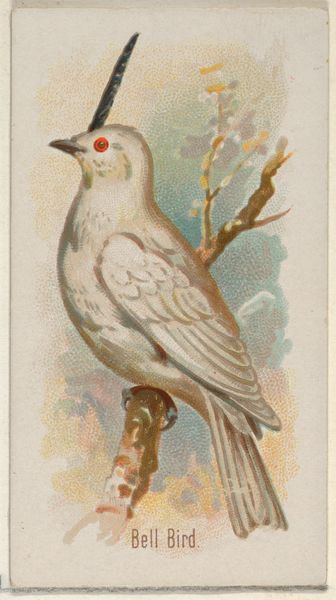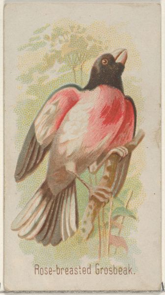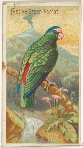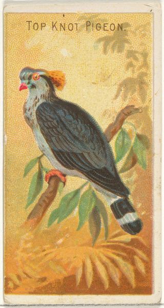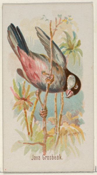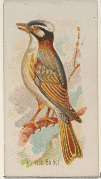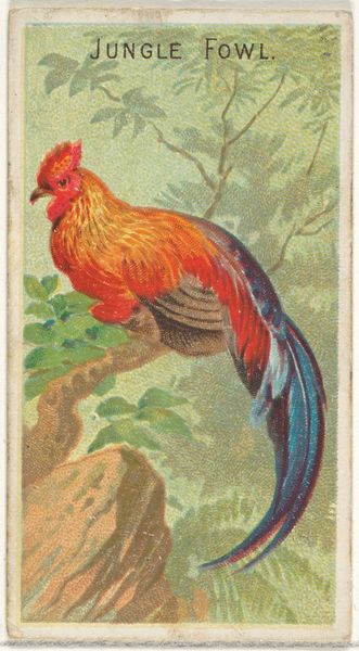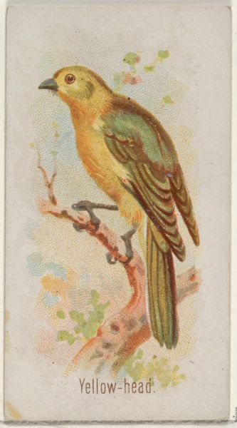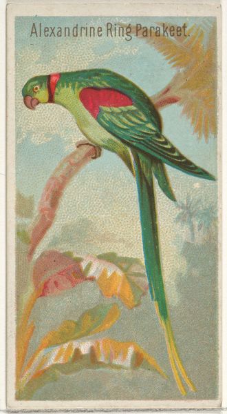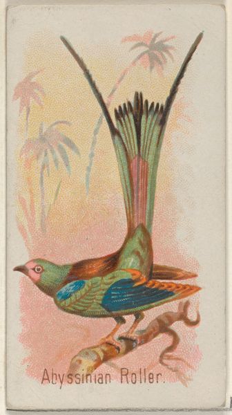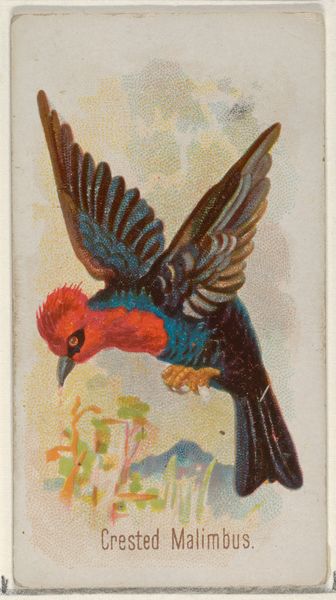
Tri-colored Cockatoo, from the Birds of the Tropics series (N5) for Allen & Ginter Cigarettes Brands 1889
coloured pencil
Dimensions: Sheet: 2 3/4 x 1 1/2 in. (7 x 3.8 cm)
Copyright: Public Domain
Editor: Here we have "Tri-colored Cockatoo," a drawing made in 1889 by Allen & Ginter for their Cigarettes Brands series. The pastel palette gives it such a delicate and almost dreamlike quality. What stands out to you from a formal perspective? Curator: Indeed. Examining the composition, we see a clear emphasis on line and color. Note the carefully delineated form of the cockatoo, rendered through a delicate network of coloured-pencil strokes. The strategic deployment of watercolour, especially in the bird's crest and plumage, serves to highlight and animate the figure against the relatively simple background. Editor: It almost feels flat, doesn't it? Like a decorative pattern. Curator: Precisely! Consider the spatial relationships—the way the artist minimizes depth through subtle color gradations and flattened forms. The lack of strong chiaroscuro flattens the image, bringing it closer to the picture plane and emphasizing its design-like qualities. The influence of Japonisme is unmistakable, reflecting a late 19th-century fascination with flattened perspective and decorative patterning found in Japanese prints. Editor: So it’s less about realism and more about…arrangement? Curator: Yes, arrangement, rhythm, and balance are the primary concerns. The cockatoo's form, juxtaposed against the botanical elements, creates a visually pleasing dialogue between figure and ground. The colors are harmonious and the textural variations produced through differing application of colour contribute to the drawing's intricate visual field. We should note the integration of text above the bird too, furthering that awareness of a flattening plane that prioritises form and the interaction between different design elements above naturalistic expression. Editor: I see it now! The shapes and colours create an intentional composition, not just a pretty picture. It makes me think differently about commercial art. Curator: Precisely! By engaging with the elements, the intention comes more into view.
Comments
No comments
Be the first to comment and join the conversation on the ultimate creative platform.
