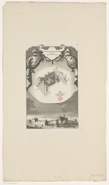
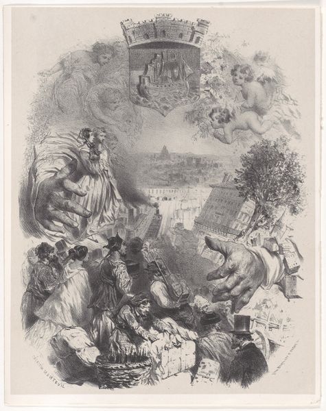
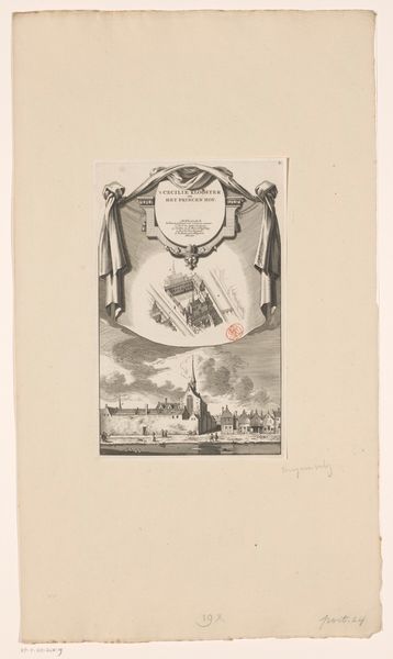
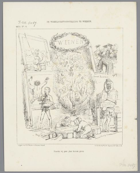
Omslag voor: Amsterdam. Oorsprong en afleiding van de namen der grachten, eilanden, pleinen, straten, stegen, bruggen, sluizen en torens dezer stad 1865
0:00
0:00
Dimensions: height 185 mm, width 120 mm, height 305 mm, width 195 mm
Copyright: Rijks Museum: Open Domain
This lithograph, “Omslag voor: Amsterdam,” was made by Johan Coenraad Leich in the mid-19th century. It combines the tradition of fine art printmaking with the vernacular form of the illustrated book cover. This artwork’s material presence is defined by the lithographic process: a greasy crayon is used to draw on a stone, which is then chemically treated so that the ink adheres only to the drawn areas. It's a relatively quick and easy process that allows for the inexpensive reproduction of images, but the artist's hand is always directly involved. This print depicts a street scene in Amsterdam, overlaid with a fantastical cloud of figures and place names. Leich was clearly engaged with the traditions of both fine art and commercial art. He combined these two worlds in a way that speaks to the increasing commercialization of art in the 19th century, and the rise of a mass market for printed images. This cover asks us to question any distinction between the fine and applied arts.
Comments
No comments
Be the first to comment and join the conversation on the ultimate creative platform.
More like this