drawing, plein-air, watercolor, pencil
#
drawing
#
dutch-golden-age
#
plein-air
#
landscape
#
watercolor
#
pencil
#
watercolour illustration
#
academic-art
#
watercolor
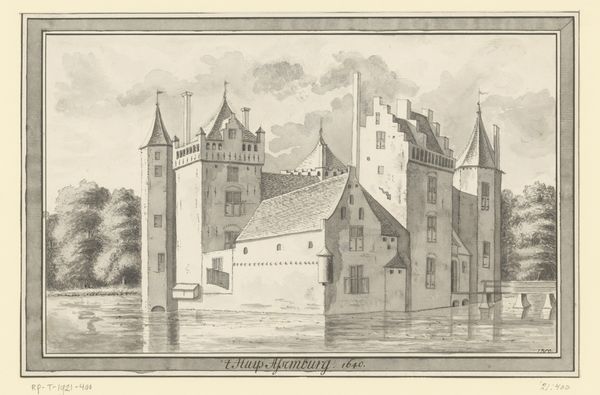
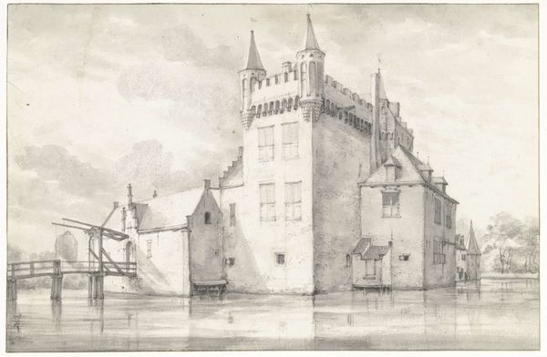
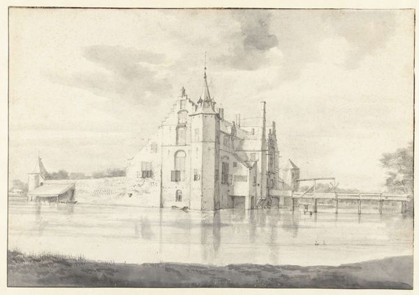
Dimensions: height 144 mm, width 180 mm
Copyright: Rijks Museum: Open Domain
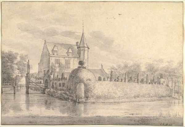
Curator: This watercolor illustration by Alexander Ver Huell, created in 1869, offers a 'View of Zuilichem Castle.' What catches your eye initially? Editor: It's incredibly grey. A monochromatic wash really dominates the texture. I immediately think about the accessibility of art supplies for an artist in 1869, and what choices led him to depict this impressive architecture and nature primarily through greyscale values. Curator: Considering the artistic trends, a choice like this could evoke a feeling of romanticized nostalgia. Note how the castle, rendered with meticulous detail, seems almost to emerge from a mist. The overall impression imparts a feeling of quiet reflection, doesn’t it? Editor: Or perhaps constraints of time and portability typical of plein-air drawing pushed the artist to such direct techniques. But even though it's seemingly simple in its execution, there’s significant craft here in suggesting mass with subtle gradients and shading alone. The bridge for instance is structurally very persuasive. Curator: Indeed. Castles often carry symbolic weight. They represent power, history, and a sense of enduring presence. This particular castle, shrouded in delicate watercolour, is positioned amid still water, so this artistic choice underscores its timeless character and creates an atmosphere that invites introspection on legacy. Editor: Do we know where Ver Huell got his paper, what pencils he favored? It feels like a direct precursor to architectural renderings used today, where process and materials have direct outcomes on legibility and intent. Curator: The lack of colour lends a certain gravitas, directing our attention towards the structural details and historical significance. While materials absolutely shape artistic choices, consider also that choosing a monochrome palette speaks to the somber weight of history. Editor: Fair enough. Either way, I feel like understanding his materials offers further clues for us to interpret the artwork. Curator: It’s fascinating how different lenses bring new nuances to a piece, don't you think? Editor: Absolutely, there's much more than initially meets the eye.
Comments
No comments
Be the first to comment and join the conversation on the ultimate creative platform.
More like this