drawing, print, engraving
#
drawing
#
baroque
# print
#
landscape
#
geometric
#
line
#
engraving
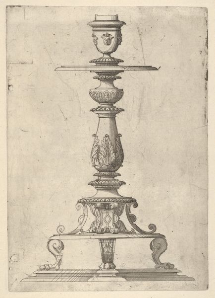
Dimensions: height 214 mm, width 158 mm
Copyright: Rijks Museum: Open Domain
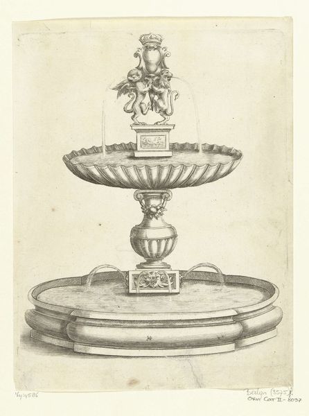
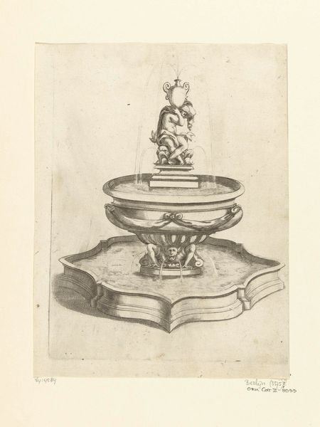
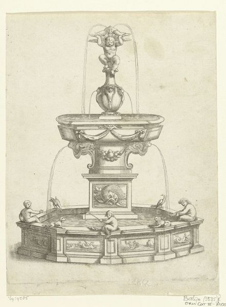
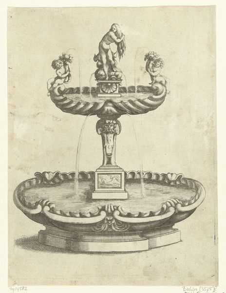
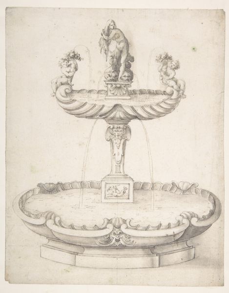
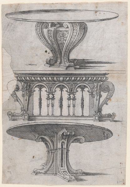
Editor: So, this engraving, "Fontein met twee waterbassins," dates back to between 1680 and 1707. It's rendered with incredible detail in line and shading. The baroque style lends a theatrical flair, and the structure of it—the perfect symmetry and geometric design—impresses me the most. What compositional elements stand out to you? Curator: Indeed, the architectural precision is captivating. Notice how the anonymous artist meticulously organizes the space with geometric forms. The fountain's levels progress from a broad, stable base to a delicate, figurative apex. The rhythm established by the repeating balustrades and the circular basins creates a visual harmony. How does this systematic arrangement influence your perception? Editor: I think it emphasizes the careful control and balance inherent in the design. The statue at the top creates an apex and a dynamic point. Without that apex, I don't know if the composition would succeed. Curator: Precisely. This verticality, culminating in the figural group, invites the eye upwards, accentuating the fountain's height. Furthermore, consider the linear quality of the engraving. The precise strokes and cross-hatching define the forms and create a sense of depth. Do you observe any tension arising from the interplay between line and volume? Editor: I see it, now that you point it out! The starkness of the lines and sharp geometrical qualities create the tension you describe. So, rather than a celebration of free-flowing, natural beauty, the artwork emphasizes artifice. Curator: Yes, it invites contemplation on the ideals of form and representation in art. Editor: Thanks! Looking at the relationship between line and depth helped me better understand the artistry.
Comments
No comments
Be the first to comment and join the conversation on the ultimate creative platform.
More like this