About this artwork
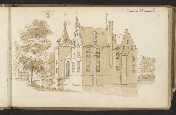
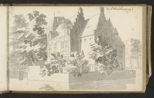
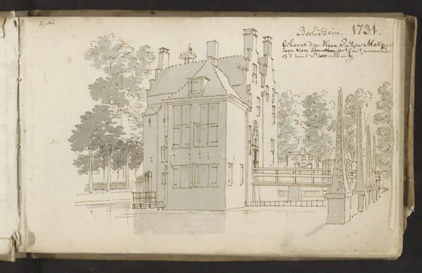
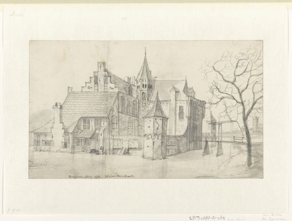
Editor: This drawing, "Kasteel Maurick te Vught," made between 1701 and 1759 by Cornelis Pronk, is just lovely. It feels so precise, almost architectural. What stands out to you about its composition? Curator: Note how Pronk's controlled application of line creates a nuanced tonal range across the drawing. The strategic deployment of hatching and cross-hatching meticulously models the architectural forms. Editor: The use of line is remarkable. It's almost scientific in its detail. I notice that the reflections in the water aren't exact replicas of the building above. Was that intentional? Curator: The slight distortion of the reflections introduces an element of dynamism, countering the rigidity of the architectural structure. Notice, too, how the artist has captured varied surface qualities: the rough texture of the brick versus the smoothness of the water. Editor: Yes, there is definitely a contrast! It makes me consider what each of these materials might represent. Is the sketch-like style evidence that this drawing may be unfinished? Curator: The apparent sketch-like quality could be understood as a deliberate stylistic choice rather than evidence of incompleteness. Observe the confidence in each stroke; a precision is noticeable despite its informal rendering. Do you notice this effect in other drawings of the period? Editor: I see your point; it’s confident but maybe gives the feeling of impermanence. Now I see both. Thanks! Curator: Yes. Considering these aesthetic nuances has deepened my appreciation for the visual intelligence at play in this artwork.
Artwork details
- Medium
- drawing, ink, pen
- Location
- Rijksmuseum
- Copyright
- Rijks Museum: Open Domain
Tags
drawing
dutch-golden-age
landscape
ink
pen
realism
Comments
Be the first to share your thoughts about this work.
About this artwork
Editor: This drawing, "Kasteel Maurick te Vught," made between 1701 and 1759 by Cornelis Pronk, is just lovely. It feels so precise, almost architectural. What stands out to you about its composition? Curator: Note how Pronk's controlled application of line creates a nuanced tonal range across the drawing. The strategic deployment of hatching and cross-hatching meticulously models the architectural forms. Editor: The use of line is remarkable. It's almost scientific in its detail. I notice that the reflections in the water aren't exact replicas of the building above. Was that intentional? Curator: The slight distortion of the reflections introduces an element of dynamism, countering the rigidity of the architectural structure. Notice, too, how the artist has captured varied surface qualities: the rough texture of the brick versus the smoothness of the water. Editor: Yes, there is definitely a contrast! It makes me consider what each of these materials might represent. Is the sketch-like style evidence that this drawing may be unfinished? Curator: The apparent sketch-like quality could be understood as a deliberate stylistic choice rather than evidence of incompleteness. Observe the confidence in each stroke; a precision is noticeable despite its informal rendering. Do you notice this effect in other drawings of the period? Editor: I see your point; it’s confident but maybe gives the feeling of impermanence. Now I see both. Thanks! Curator: Yes. Considering these aesthetic nuances has deepened my appreciation for the visual intelligence at play in this artwork.
Comments
Be the first to share your thoughts about this work.