drawing, graphic-art, coloured-pencil, print, paper, watercolor
#
drawing
#
graphic-art
#
coloured-pencil
#
water colours
# print
#
paper
#
watercolor
#
coloured pencil
#
watercolour illustration
#
decorative-art
#
calligraphy
Dimensions: sheet: 13 x 9 5/8 in. (33 x 24.5 cm)
Copyright: Public Domain
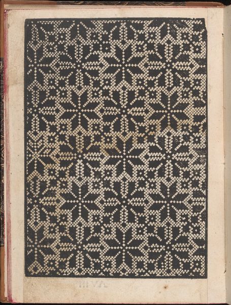
Curator: This is Alfred Henry Forrester’s “Lettered title: Christy”, made sometime between 1845 and 1855. It combines drawing, watercolour, and coloured pencil. It’s currently housed at the Metropolitan Museum of Art. Editor: Well, visually, the lettering definitely grabs your attention, doesn't it? There’s something both decorative and almost austere about its vertical presentation on the page. Curator: I agree. The arrangement of the lettering, along with the bold, singular black ground, frames the inscription, immediately prioritizing a clear, central concept within a tightly constructed field of meaning. Note the embellishments; what might they suggest? Editor: For me, it suggests craft and handiwork, like it's straight out of a sign-maker's workshop. The materials give the piece a very hands-on, almost rough-hewn aesthetic despite its elegance, don't you think? Curator: Indeed. The visual impact and material execution combine to generate visual friction, creating what one might call structural dynamism through aesthetic tension. It draws attention to both form and substance, I’d say. Editor: But shouldn’t we also ask why "Christy"? Perhaps it was designed as part of something functional. It would be compelling to know what exactly was commissioned from him in order to situate it. What process or set of labour relations determined his approach? Curator: That's an insightful point regarding its societal integration. The use of color and the particular rendering of the word “Christy”, are they strictly tied to individual whims or artistic desire, or is there more happening beyond surface impressions? It also suggests considering social class, labor, and potential commodification. Editor: Precisely. Examining those conditions exposes it to new lines of questioning and situates the making of this particular lettering squarely within an understandable cultural context. Curator: Quite. By examining the underlying syntax, "Christy" becomes not just a title but a symbolic anchor around which these broader societal and visual elements begin to take shape. It really expands our understanding of the visual impact as a form of constructed knowledge. Editor: So it has me pondering both process and product... very interesting. Curator: Agreed; it is fertile ground for analysis, indeed.
Comments
No comments
Be the first to comment and join the conversation on the ultimate creative platform.
