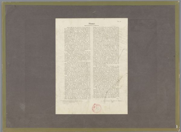
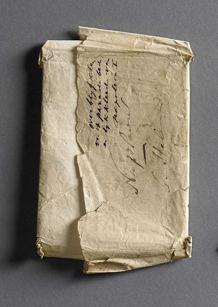
drawing, paper, ink
#
portrait
#
drawing
#
paper
#
ink
Dimensions: width 22.5 cm, height 27 cm
Copyright: Rijks Museum: Open Domain
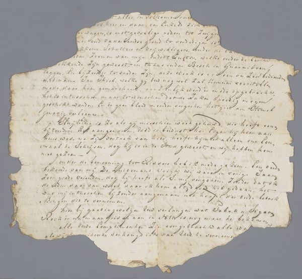
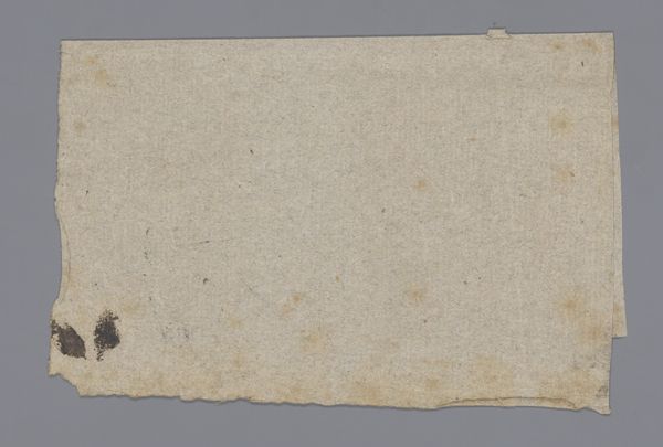
Editor: We’re looking at a drawing entitled "Briefje behorende bij het zelfportret van Nicolaas Seuntjes," made around 1735. It’s ink on paper. It feels quite fragile just looking at it, aged but also oddly resilient. What do you see as the most compelling visual elements here? Curator: Initially, my attention is drawn to the formal relationships created by the layering of paper and the inscription itself. The geometry of the added note disrupts the darker backing. Consider how the artist utilized the contrast of textures and hues to structure the overall visual experience. What’s significant to me is how this structure shapes the observer's comprehension. Do you observe a hierarchy of forms or shapes competing for dominance within the picture plane? Editor: I see how the note's placement creates a division, but the darker paper seems to contain it. Are we meant to consider the black frame of equal value to the rest of the work? Curator: Indeed. The function of framing, in a formalist understanding, is paramount, especially with works on paper. In a drawing like this, the deliberate inclusion of a secondary material or plane expands our engagement with the composition. Can you envision alternative framings that could produce a distinct viewing experience, given these materials? Editor: I never considered the importance of literal framing this way before. The deliberate contrast really elevates what might have been missed. Curator: Exactly. We’ve highlighted the role of the materials and composition in creating visual meaning, something to remember as you approach future analysis of similar artworks.
Comments
No comments
Be the first to comment and join the conversation on the ultimate creative platform.
More like this