painting, watercolor, architecture
#
sky
#
water colours
#
painting
#
landscape
#
watercolor
#
mountain
#
orientalism
#
line
#
architecture
Copyright: Public domain
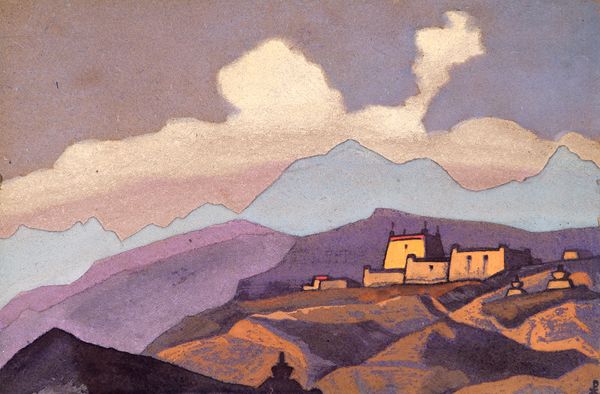
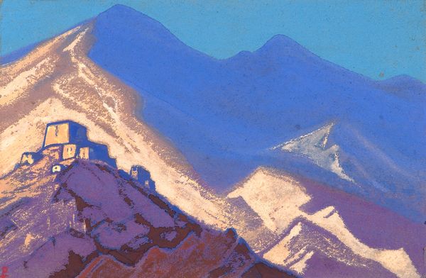
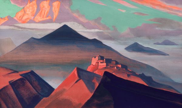
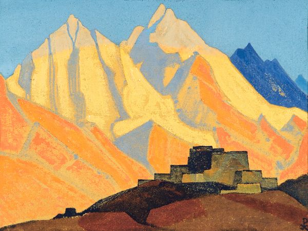
Curator: This watercolour painting, "Tibet. Himalayas." attributed to Nicholas Roerich, offers us a window into the artist’s fascination with Eastern spirituality and landscape. What are your initial thoughts? Editor: A somber grandeur. The simplified forms of the mountains and architecture, almost like paper cutouts, give it a strangely flattened, otherworldly quality. It really emphasizes the materiality of the watercolors. Curator: Precisely. Roerich's spiritual quest led him through Asia, and his art became intrinsically linked to his beliefs. This painting needs to be viewed as more than a beautiful landscape, doesn’t it? We must understand its context as part of his Theosophical view and commitment to exploring Eastern philosophy and linking diverse cultures. Editor: And that Theosophical impulse is clear. There’s a leveling here – flattening the Himalayas makes them accessible, perhaps even mass producible as images, diminishing their awe-inspiring scale. The pigment itself, watercolor, feels humble in contrast to the vastness of the subject. Curator: Right. He uses this simplification, I argue, to transcend the specifics of place. This rendering gestures towards the idea of a universal, sacred landscape. The choice of watercolor also carries the meaning of humility and accessibility. The artist’s style minimizes details and is in keeping with his broader vision to connect humanity through simplified forms. Editor: And the vibrant color choices! The building’s yellow against the lavender hills... This reminds me of industrial dyes, readily available, and altering the landscape, but perhaps here it is instead pointing to an unreal place outside of capitalist modes of extraction and alteration. Curator: Indeed, these seemingly arbitrary colour choices further contribute to this transcendence. He suggests more than represents. Ultimately, it's about fostering cultural exchange, peace, and a collective human experience rooted in spiritual understanding. Editor: It's fascinating how his engagement with material and process gives a lens through which to consider these broader narratives about spirituality and accessibility, and his engagement with line over form. I like that our interpretations leave so many more doors open. Curator: Agreed, its simplified style becomes its strength as a kind of social tool.
Comments
No comments
Be the first to comment and join the conversation on the ultimate creative platform.
More like this