fantasy concept art
fantasy art
website theme
fantasy-art
figuration
line
symbolism
Copyright: Public domain
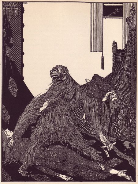
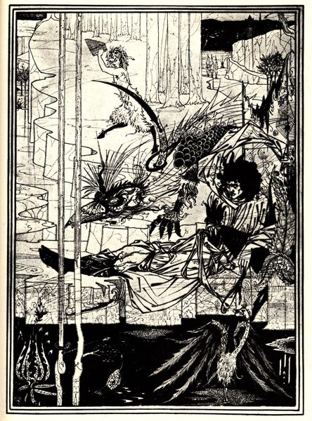
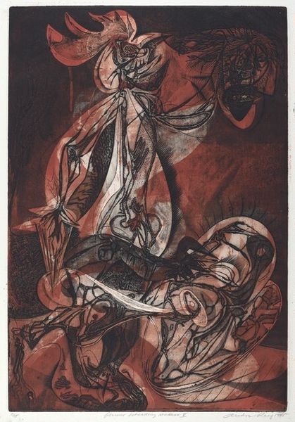
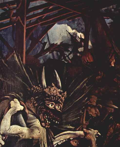
Harry Clarke made this illustration, it seems, by embracing the weird. It’s got that turn-of-the-century decadent style, but it feels like it could have been made yesterday. Clarke’s palette is all murky reds and browns, which gives the piece a sinister feel. But the way he renders the monster’s fur is so delicate, like he’s trying to make it beautiful despite its obvious grotesqueness. It feels like a process of layering, building up the image through thin washes of color, letting the under layers peek through. Look at the way he renders the snake, all shiny and iridescent. It’s almost hypnotic. And notice how he uses these little vignettes at the bottom, like windows into another world. It reminds me of the work of Odilon Redon, who also embraced the strange and the surreal. It's a process of letting the imagination run wild, and seeing where it takes you. Ultimately, it's more about the questions than the answers.
Comments
No comments
Be the first to comment and join the conversation on the ultimate creative platform.