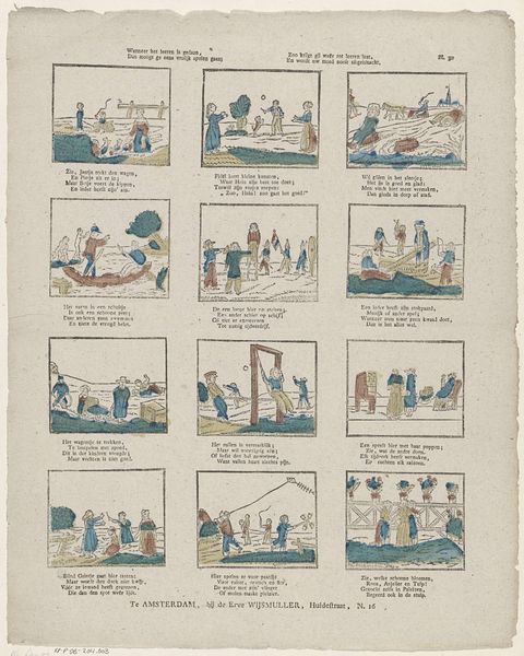
Ballon, ballon, schapo ballon! / Wie of het eerst die smaak verzon? / Die heden geen ballonhoed draagd, / Word als een dommen uit beklaagd 1791 - 1812
0:00
0:00
johannesegbertusvanlieshout
Rijksmuseum
print, watercolor
#
narrative-art
# print
#
watercolor
#
watercolour illustration
#
genre-painting
#
watercolor
Dimensions: height 403 mm, width 334 mm
Copyright: Rijks Museum: Open Domain
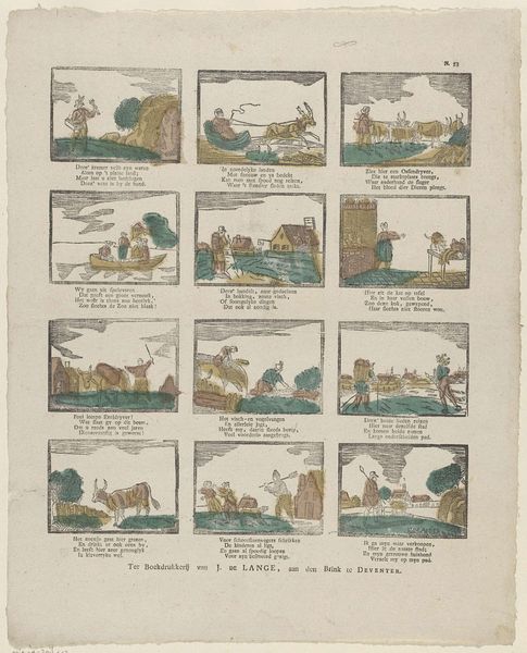
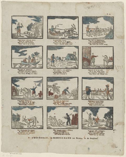
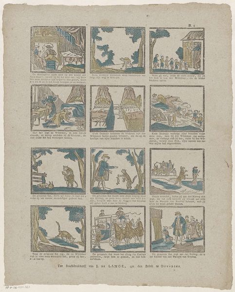
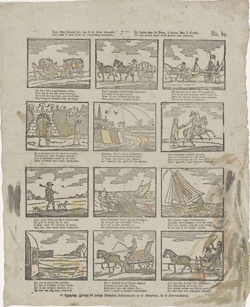
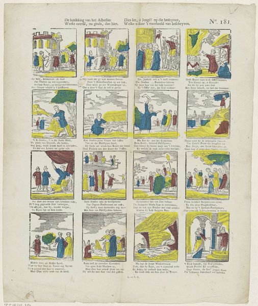
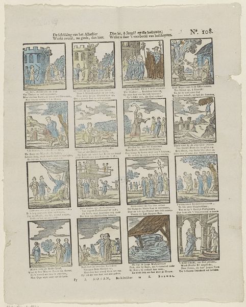
Editor: We're looking at "Ballon, ballon, schapo ballon! / Wie of het eerst die smaak verzon? / Die heden geen ballonhoed draagd, / Word als een dommen uit beklaagd," a watercolor print made between 1791 and 1812. It feels almost like a comic strip with a quirky, folktale aesthetic. I’m drawn to the repetition of images within the larger grid structure. What do you see in this piece from a Formalist perspective? Curator: The first thing that strikes me is the organization. Notice how the artist employs a strict grid format, subdividing the work into sixteen distinct cells, each housing its own miniature scene. How do these cells interact, if at all? Does each function independently or is there a flow established through composition or colour? Editor: I think it is supposed to work like a rebus or visual riddle, a theme and variation. Curator: Precisely. And examine the colours – the muted palette of blues, reds, and greens. What purpose does this limitation serve, considering the potential for greater tonal variety even within watercolour printmaking? Editor: Perhaps to keep the emphasis on the line work, to stress the construction rather than the ornamentation. The focus is not to draw a "realistic" representation but instead uses shapes as simplified symbols, that may come together to form an encoded meaning. Curator: An astute observation. The colour serves not to imitate nature but to delineate form and define the visual field of each frame. Note as well the curious flattening of space within each cell, a denial of traditional perspective. How does this flattening contribute to the overall reading of the artwork? Editor: It feels more like a diagram than a narrative, which heightens the visual puzzle quality, because its symbolic message might come across clearer without an impression of depth. I noticed details I'd missed before! Thanks! Curator: It reveals how form dictates content; by stripping away illusionistic depth, the artwork foregrounds its internal structures and its mode of symbolic presentation. A worthwhile investigation indeed.
Comments
No comments
Be the first to comment and join the conversation on the ultimate creative platform.
More like this