Dimensions: height 157 mm, width 225 mm
Copyright: Rijks Museum: Open Domain
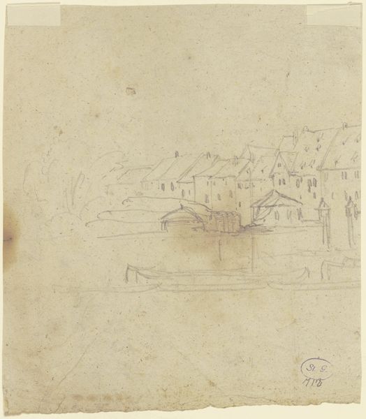
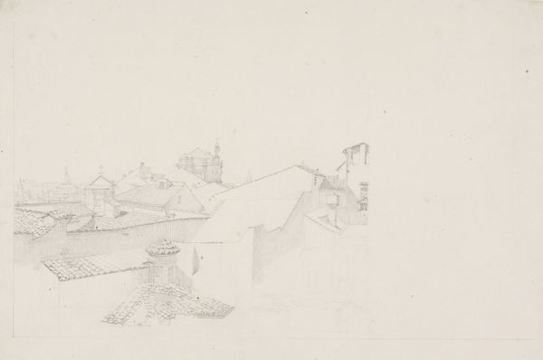
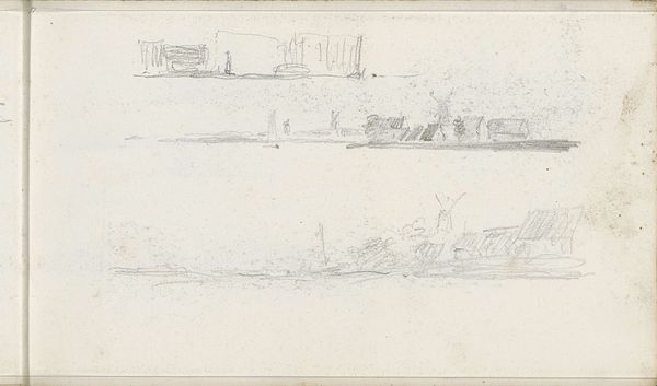
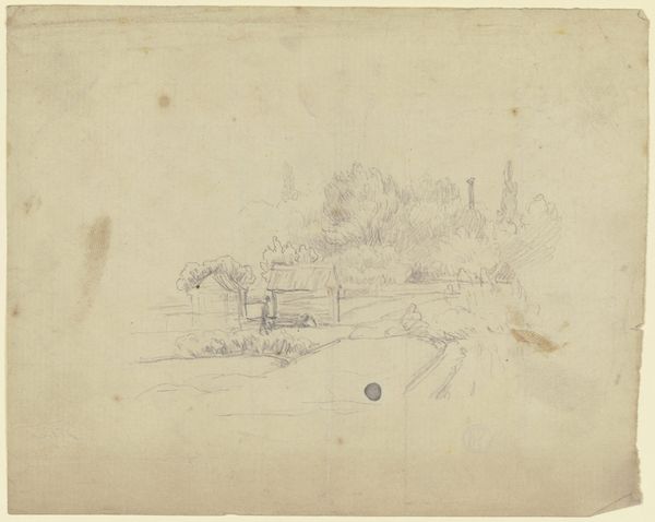
Editor: This is Willem Witsen's "Gezicht in Amsterdam," likely created between 1870 and 1923. It’s a pencil and pen drawing. What strikes me immediately is its unfinished quality; it feels very immediate, like a quick impression captured in a sketchbook. How do you interpret this work? Curator: Indeed. The raw immediacy is compelling. Observe how Witsen uses line – the economy of the strokes and the stark contrast between them and the white of the paper. It’s almost a diagram, a mapping of spatial relations more than a literal representation. The varying line weights are also telling, don’t you think? Editor: I do. The bolder lines definitely ground the composition and emphasize the architecture near the waterline, while the fainter lines almost fade into the background, which suggests distance and depth even with so few marks. Is there a suggestion of atmospheric perspective? Curator: Precisely! He masterfully conveys depth through line variation alone. What effect does the open space—the bare paper—contribute to the overall composition and feeling? Editor: The emptiness makes it feel vast, almost dreamlike. It puts the emphasis on the sparseness of the depicted scene, emphasizing quiet reflection on the cityscape. Curator: Exactly. The structural elements--the composition, line, space, and the materiality of the drawing-- are the very language Witsen uses to shape the viewers perception. A lot is said with so little. Editor: So, focusing on those visual choices helps me see how much can be communicated through what is seemingly simple or unfinished. Curator: Absolutely. There is no "correct" reading, yet the very materiality and form is how Witsen chose to share the soul of Amsterdam.
Comments
No comments
Be the first to comment and join the conversation on the ultimate creative platform.
More like this