photography, gelatin-silver-print
#
portrait
#
photography
#
gelatin-silver-print
#
modernism
Dimensions: height 174 mm, width 231 mm, height 119 mm, width 168 mm
Copyright: Rijks Museum: Open Domain
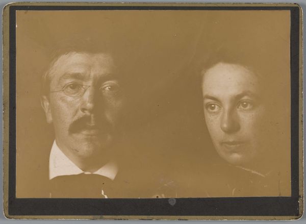
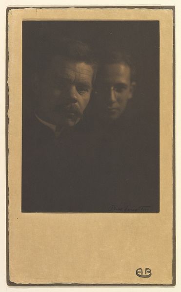
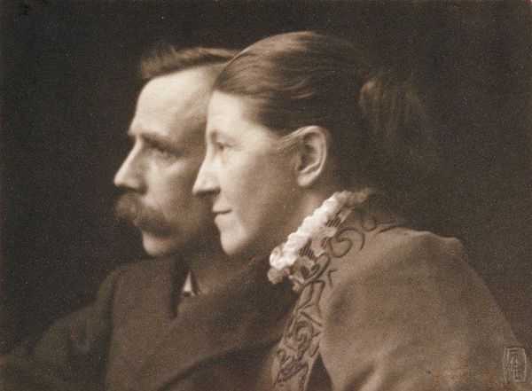
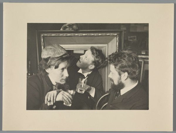
Editor: We're looking at a gelatin-silver print called "Reproductie naar een foto van Willem Witsen," dating roughly between 1860 and 1915. The portrait of a couple is stark and the tones feel incredibly modern to me, and it makes me wonder what we should be looking at. How do you interpret this work? Curator: The composition hinges on the stark contrast between the subjects and the ground. Notice how the photographer uses chiaroscuro, this dramatic light and shadow play, to sculpt their forms. The limited tonal range enhances the austerity. Are they physically close? Do they interact? Editor: Not really, they almost look as if two portraits have been juxtaposed. There’s a void separating the subjects which feels almost like… detachment. Curator: Precisely. The gaze is equally crucial. His, directed outward, meeting the viewer directly. Hers, averted, turned inward. This generates an immediate dynamic. Editor: So you’re seeing a divergence or fragmentation that’s as much about the formal elements as it is about the relationship, if any. What do you make of that neutral expression, neither sadness nor joy is obvious? Curator: That restraint channels an emotional ambiguity, shifting interpretive weight back onto pure form and the photograph's intrinsic, almost melancholic, qualities. The subdued affect allows you as a viewer to enter their reality by reflecting on your own values. Notice that no smile can easily mean a lot. The photographer allows for subjective viewing and a formal relationship with shapes, light and shadow to evolve and interact. The light and dark qualities of this gelatin print underscore those notions of objectivity and abstraction inherent in modernist photography. What have we discovered about this artwork today? Editor: I came in expecting a standard portrait, and now I see how every choice emphasizes this interplay between form and meaning, and creates emotional impact through subtle visual cues and the absence of connection. Thanks for that analysis.
Comments
No comments
Be the first to comment and join the conversation on the ultimate creative platform.
More like this