drawing, pencil
#
drawing
#
landscape
#
pencil
#
watercolor
#
realism
Copyright: Rijks Museum: Open Domain
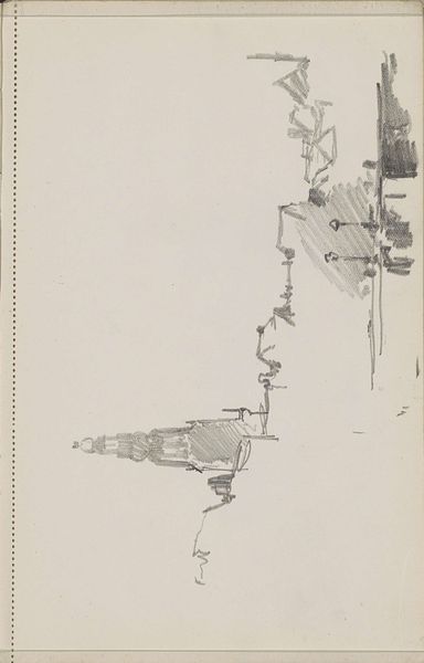
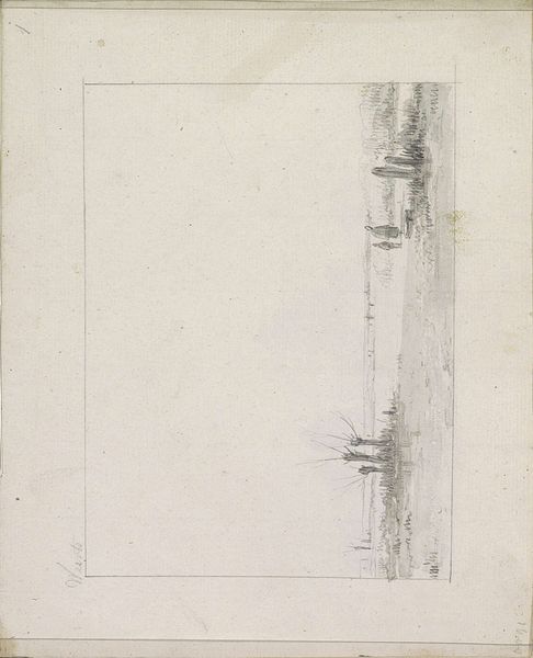
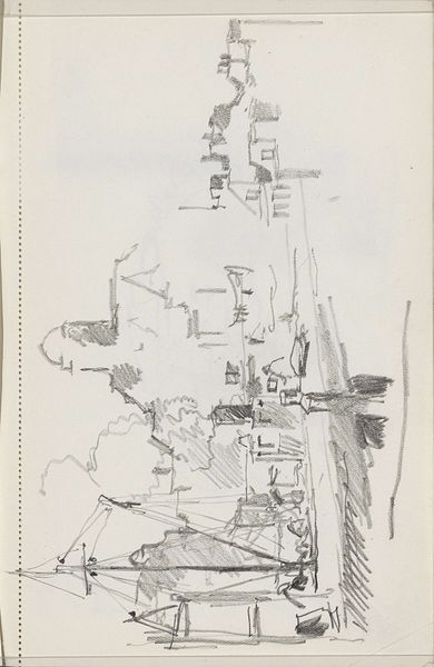
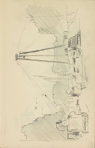
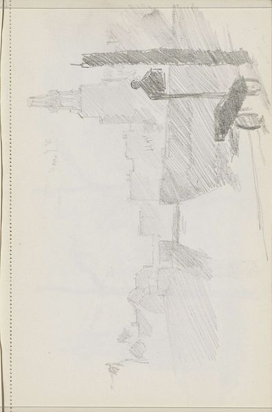
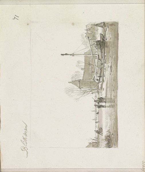
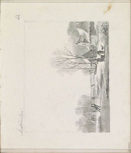
Editor: So, here we have "Bomschuiten op het strand," a pencil drawing by Andreas Schelfhout, dating from around 1825-1829. It feels so open and sparse. What do you see in this piece, focusing on its form? Curator: I observe primarily a study in contrasts. Consider the stark horizontality of the beach against the rising verticals of the ships’ masts. Notice how the artist utilizes the limited tonal range of the pencil to create depth. The shading, concentrated around the ships and figures, gives them substance, while the open sky maintains a feeling of airy distance. How does the framing itself, that borderline, impact your reading? Editor: It makes me feel like I'm looking through a window at a fleeting scene. Is the starkness perhaps related to the limitations of working solely in pencil? Curator: Precisely. The restricted palette forces us to examine the nuances of line and tone. The cross-hatching creates areas of shadow and weight, essential for grounding the composition. Observe the negative space around the sails; how does that inform your perception of movement, or stillness? Editor: The negative space does seem to enhance the quiet feeling of the scene. It's not a dramatic seascape. More like a casual moment captured. Looking at how simple, bare lines can create an impressive composition makes me think differently. Curator: Indeed, sometimes the absence of elements speaks as loudly as their presence. It emphasizes that it is an image of a Dutch shoreline that provides such impact through tonal differentiation in the water and clouds. By emphasizing certain shapes and minimizing other detail, he evokes emotion in the audience. Editor: That is definitely the key feature of the artwork that I'll remember going forward! Thanks!
Comments
No comments
Be the first to comment and join the conversation on the ultimate creative platform.
More like this