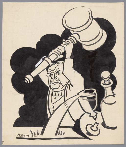
graphic-art, lithograph, print, poster
#
graphic-art
#
lithograph
# print
#
caricature
#
orientalism
#
cartoon style
#
cartoon carciture
#
poster
Dimensions: height 100 mm, width 145 mm
Copyright: Rijks Museum: Open Domain
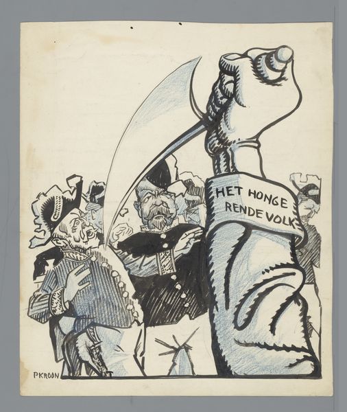
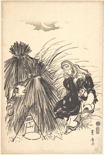
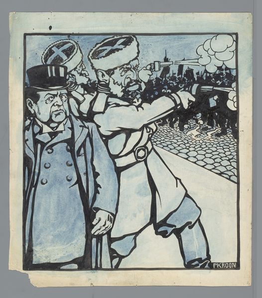
Alfaro Reijding made this printed postcard, titled 'China prentbriefkaart 'De IJzeren contra de Gele vuist'', sometime around the turn of the century. The way the artist uses black and white against a muted yellow, with such bold lines, reminds me that artmaking is really just a conversation between shapes and colours. Look at the materiality here, the way the ink sits on the surface. You can almost feel the texture of the paper. Reijding simplifies forms into near-caricatures, with the figure's clenched fist contrasting to the small man being held. There's a playful tension here, as if the artist is inviting us to question power dynamics. The title itself, with its mention of "Iron" versus "Yellow Fist," suggests a deeper narrative. Reijding's stark contrasts and simplified forms feel related to the later work of someone like George Grosz, who also used art to comment on social and political issues. It's a reminder that art doesn't have to be pretty or polished to be powerful.
Comments
No comments
Be the first to comment and join the conversation on the ultimate creative platform.
More like this