Curatorial notes
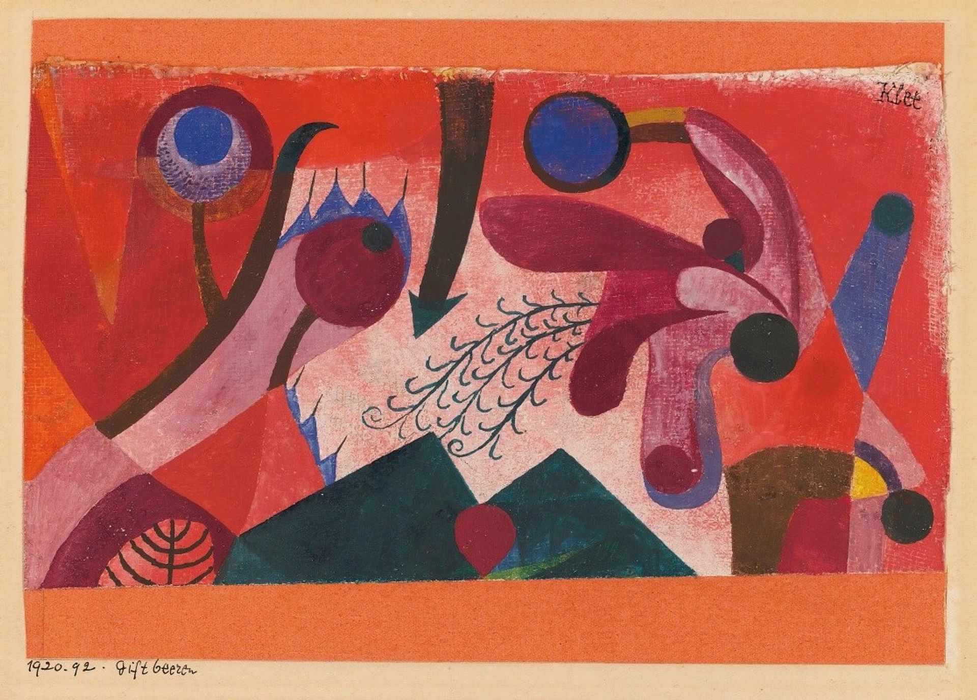
Paul Klee made 'Giftbeeren' with watercolour and ink, I'm guessing on paper, and just look at that gorgeous orangey-red ground he's given us! The paint feels like it's been applied in layers, thin washes mostly, leaving the texture of the paper to show through. There's something almost topographical about the layering of colour, like the build up of sediment over time, or the feeling of a memory resurfacing. Look at the little dark green mountains in the foreground – so solid, with that one red heart-berry in front – they remind me of tiny bunkers, hunkering down. Then there's the way that downward pointing arrow divides the composition, and yet, the little curly sprouts seem to offer a way through. Klee was always such a playful formalist, right? Like Miro, you can see him making use of surrealist figuration. I’m reminded of Joan Miró's biomorphic shapes, the way he used simple forms to create a sense of organic growth and playful ambiguity. It's all about embracing the unexpected.