Copyright: TRACY 168,Fair Use
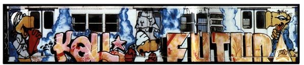
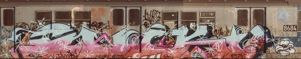
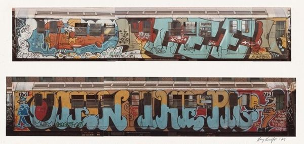
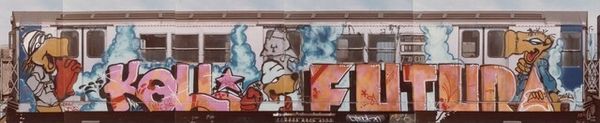
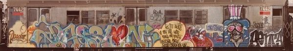
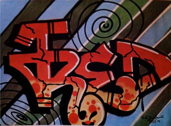
Editor: So, here we have Tracy 168's "Tracy & King2," from 2001, an acrylic piece depicting graffiti art. The colours really pop against the monochromatic background, but I'm curious – what initially grabs your attention about its formal elements? Curator: Immediately, it’s the tension between flatness and depth. Notice how the linear perspective of the train car creates a receding space, but the cartoonish figure and the graffiti, rendered in bold, flat colours, resist this illusion. Editor: Yes, that interplay is striking. The figure seems almost pasted on, disrupting the perspective. How do you interpret that disruption formally? Curator: It forces a reconsideration of space and representation. The graffiti itself, "King2 Tracy", defies traditional perspective. Its layering and jagged edges, create a dynamic surface that contrasts with the rigid lines of the train car. We must ask ourselves what statements about art the artist wishes to make here? Editor: The use of contrasting colours – the vivid pinks and greens against the grey scale – definitely creates a striking visual. Curator: Precisely! This chromatic contrast, amplified by the bold black outlines, enhances the sense of flatness and emphasizes the surface as a constructed plane, rather than an illusionistic window. Editor: It’s almost like the artist is making the point that it’s not trying to reflect reality perfectly, but rather a specific chosen section. Curator: Exactly! He manipulates the formal elements to highlight the artificiality of representation and call our attention to the act of seeing itself, disrupting what we perceive through art and our interpretation of reality. Editor: This piece definitely provides a unique reflection, and by playing around with dimensions and color contrasts, the artist creates new dynamics that go beyond his street style origins. Thank you! Curator: Thank you.
Comments
No comments
Be the first to comment and join the conversation on the ultimate creative platform.