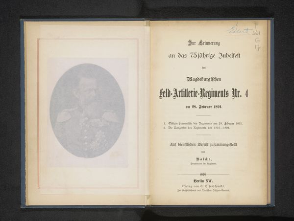
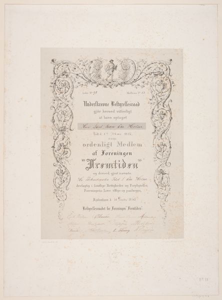
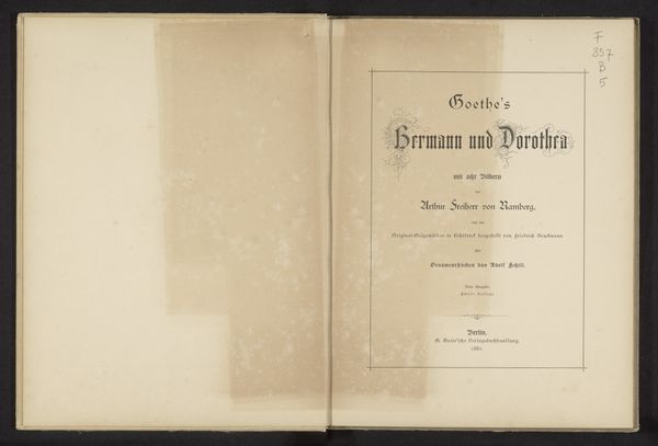
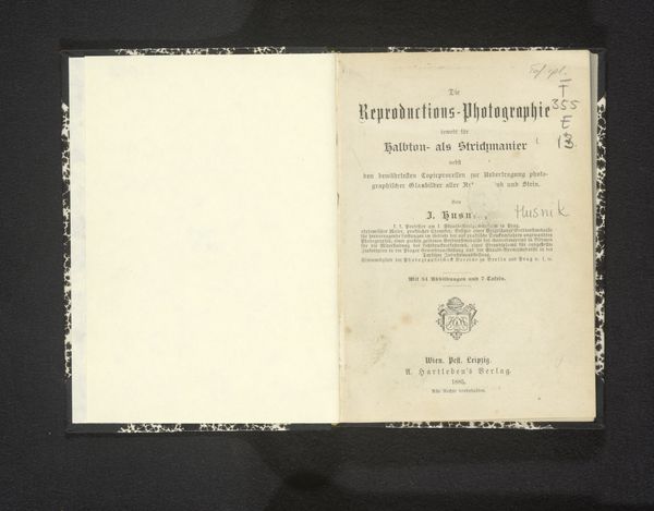
graphic-art, print
#
graphic-art
# print
Dimensions: height 233 mm, width 321 mm, thickness 22 mm
Copyright: Rijks Museum: Open Domain
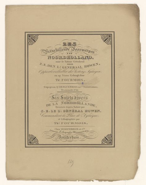
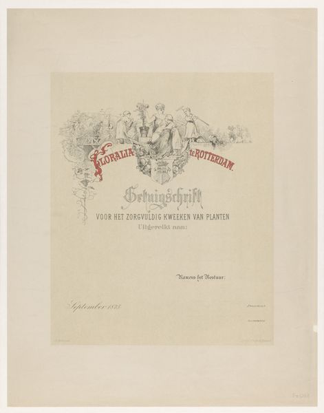
Editor: Here we have "Des Lebens Freuden!" from circa 1875 by Charles Claesen, a print. I'm struck by its formality, especially the rigid framing. What design choices stand out to you? Curator: Observe how the calligraphic title establishes a hierarchical structure, visually dominating the subsequent text. The framing ornaments in the corners mirror each other to promote bilateral symmetry that contributes to the stability of the presentation. How might you describe the interplay between text and ornament here? Editor: The corner ornaments contrast the text's geometry and serifs, giving it a handcrafted, traditional aura. So it balances both form and a tactile sense of process? Curator: Precisely. The use of contrasting fonts and decorative elements works together to enrich the composition by creating differentiation within similarity. What’s your feeling about the work’s monochrome palette? Editor: The limited tonal range creates a quiet, concentrated impact. Is there more emphasis placed on structure with this conscious choice? Curator: Indeed. The starkness directs the viewer's attention towards line and form, underscoring the deliberate arrangements of visual information, which invites careful contemplation of each individual element. It gives the piece a sense of purpose, highlighting the essence of the artwork's intrinsic qualities. Editor: I hadn’t fully appreciated how even this limited palette is deployed structurally, giving an even more focused message to the audience. Curator: That keen attention is what makes engaging with pieces like these so exciting and keeps conversations on design open and refreshing.
Comments
No comments
Be the first to comment and join the conversation on the ultimate creative platform.
More like this