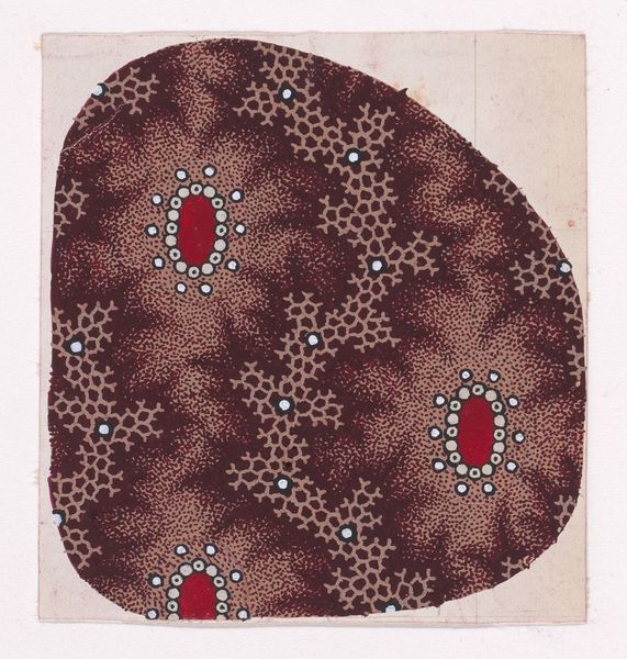
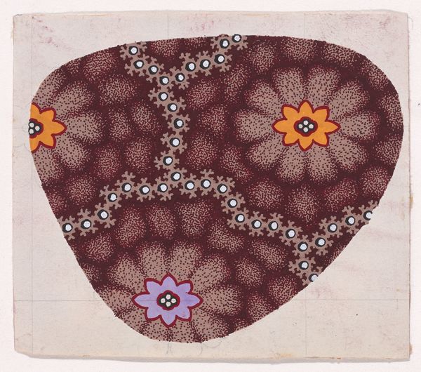
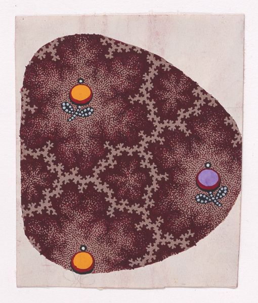
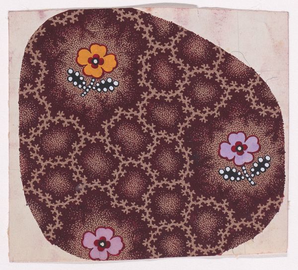
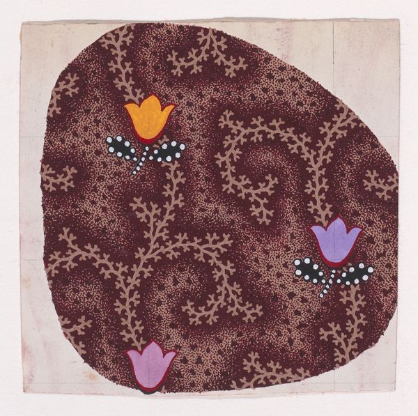
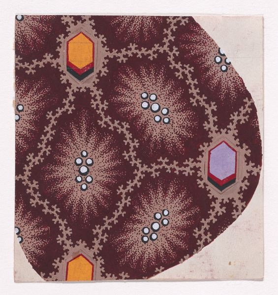
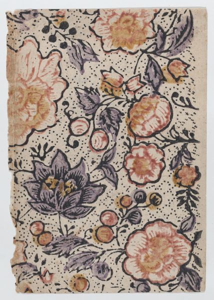
Textile Design with Alternating Vertical Rows of Stylized Flowers Decorated with Pearls and Alternating Rows of Amoeba Shapes Made with Dots over an Abstract Honeycomb Pattern Background 1840
0:00
0:00
print, textile
# print
#
textile
#
geometric
#
decorative-art
Dimensions: Sheet: 3 7/16 × 2 13/16 in. (8.8 × 7.2 cm)
Copyright: Public Domain
Curator: Before us, we have an exquisite textile design created around 1840. The artist, who remains anonymous, employs ink and watercolor, enhanced with metallic pigment, on paper to conjure a pattern that is both intricate and visually arresting. It's currently part of the collection at the Metropolitan Museum of Art. Editor: It strikes me as intensely ornamental, almost suffocatingly so. The repetition, while decorative, feels a bit relentless. Curator: Absolutely. The layers of pattern upon pattern embody a very specific sensibility of the era, one which embraced a sense of abundance and luxury reflecting societal values of class, and industry, notably in Europe's colonial aspirations. This could be linked to ideas of exoticism, and the power of trade with colonized lands. Editor: Let’s unpack this decorative strategy. The honeycomb ground provides a field for vertical rows featuring those stylized floral forms, interspersed with amoeba-like shapes constructed from clusters of dots. What is created by the pattern design itself is visual hierarchy with alternating rhythms? Curator: I appreciate you drawing our attention to the underlying geometric framework that structures the design. What about its interplay of organic and geometric shapes? How might this have appealed to audiences within particular social strata? Also how the pattern’s function influences interpretations – thinking about things such as social identity. Editor: I would respond by noting how the colors are restrained—earthy browns, creams, punctuated by smaller splashes of lavender and burnt orange in those flower details, for instance—suggest an exercise in controlling visual density and tonal range, preventing absolute chaos! Curator: The artist strategically deploys romanticist visual languages, a commentary on the values of beauty during this epoch, whilst incorporating, through geometric design, its relationship to the rise of industrial technologies. But it prompts deeper questions regarding its circulation, as well. Was it for European markets, or was it intended to entice consumers elsewhere? These issues shape our reading experience Editor: Perhaps. For me the formal relationships speak clearly. Looking at it now, this design shows not just visual complexity, but also an interesting harmony achieved through balance and controlled coloration. It's something that really stands out upon closer observation. Curator: Agreed, our discussion brings to light a multilayered relationship. Understanding its artistic presentation encourages critical engagement.
Comments
No comments
Be the first to comment and join the conversation on the ultimate creative platform.
More like this