watercolor
#
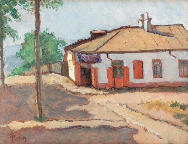
impressionism
#
landscape
#
watercolor
#
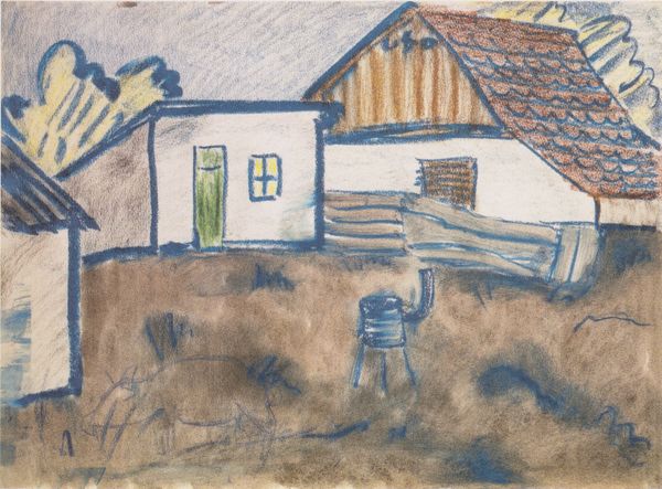
coloured pencil
#
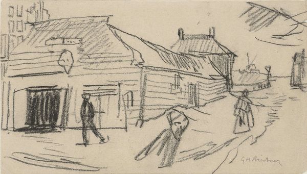
genre-painting
#
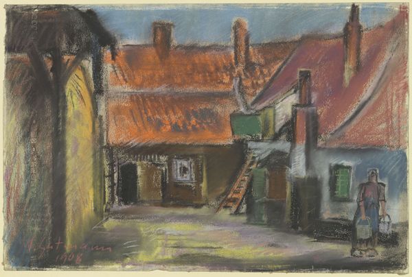
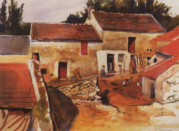
watercolor
Copyright: Public domain
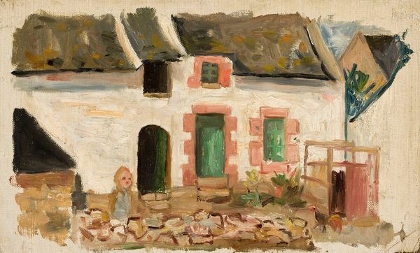
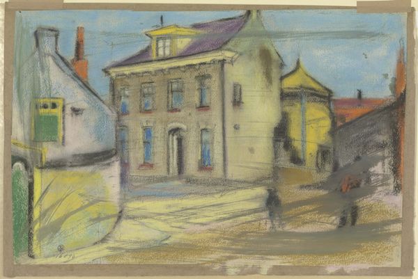
Editor: So, this watercolor by Stefan Dimitrescu is called "In front of the House." It's a simple, kind of quiet scene. The washes of color give it a soft, almost dreamy feel. How do you approach interpreting a piece like this? Curator: Note the deliberate arrangement of forms. The geometric simplicity of the houses, punctuated by the darker accents of the windows and doors, provides a structural rhythm. What effect does the artist create by using these limited color harmonies? Editor: Well, I think the limited palette, mainly earth tones and whites, creates a sense of harmony. Everything feels very cohesive and unified. The muted colors also contribute to the tranquility of the scene. Curator: Precisely. And observe the placement of the solitary figure in relation to the architecture. The scale and position relative to the buildings evoke feelings of intimacy. What would you say about the tension between representation and abstraction in this composition? Editor: That's interesting. The houses are clearly representational, but the loose brushstrokes and the way the colors bleed into each other definitely push it towards abstraction. It’s like he’s capturing an impression of a place, rather than a precise rendering. Curator: Indeed. Consider how Dimitrescu's approach is both descriptive and deeply personal, and the interaction of compositional elements creates balance and order, thereby guiding us to reflect on its aesthetic significance. Editor: It's fascinating how focusing on the structure and the visual language of the piece can reveal so much. Thanks for sharing that perspective. Curator: My pleasure. Every brushstroke tells a story if we learn how to listen to the language of form and color.
Comments
No comments
Be the first to comment and join the conversation on the ultimate creative platform.
More like this