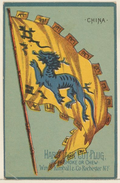
China, from Flags of All Nations, Series 1 (N9) for Allen & Ginter Cigarettes Brands 1887
0:00
0:00
print, paper
# print
#
asian-art
#
figuration
#
paper
#
decorative-art
Dimensions: Sheet: 2 3/4 x 1 1/2 in. (7 x 3.8 cm)
Copyright: Public Domain
Curator: This colorful print is titled “China, from Flags of All Nations, Series 1 (N9) for Allen & Ginter Cigarettes Brands,” dating back to 1887. You can currently find it at the Metropolitan Museum of Art. What are your first thoughts on this work? Editor: Strikingly vibrant, despite the constraints of what must have been a small format. The red and gold create a rich, almost decadent feel, while the azure dragon introduces a dynamic focal point. Curator: Indeed. It was originally designed as a collectible card for cigarette packs. What you’re sensing is the popular visual language of Orientalism mixed with Japonisme, reflected in the decorative elements. What stands out to me is the symbolic weight the dragon carries. In Chinese culture, it represents power, good fortune, and imperial strength. Its presence here, however, is mediated through a Western lens. Editor: The flag's irregular edge, almost like a tattered scroll, offers a visual metaphor, maybe hinting at fragility beneath the displayed power. But consider how the lines and flat planes build the composition—it emphasizes decorative elegance rather than deep symbolic commentary. The artist has used clear lines and minimal shading to deliver a direct message of visual delight. Curator: While I see the aesthetic intention, these visual choices reinforce existing stereotypes, transforming a complex culture into a set of easily digestible symbols. It strips agency, offering a romanticized and often inaccurate portrayal that feeds into the West's imagined East. Note the characters, seemingly decorative at first glance, likely rendered inaccurately to cater to Western audiences, exoticizing and simplifying at the same time. Editor: Maybe so, but I find the contrast between the flag's field and the patterned border compelling. The juxtaposition plays with textures, offering a complexity beyond simple symbolism. The colors themselves create a structured visual experience. The red provides a solid background for the warmer golds and that shocking blue. Curator: It's easy to get caught up in the surface charm, but exploring the deeper meanings of this artwork opens up difficult dialogues about cultural representation and the history of colonialism. It’s a reminder of how symbols can be manipulated and redeployed in ways that obscure as much as they reveal. Editor: A good reminder that even within seemingly simple and pretty things, we find structural cues pointing to significant cultural issues. This close-up, it makes it really apparent!
Comments
No comments
Be the first to comment and join the conversation on the ultimate creative platform.
More like this