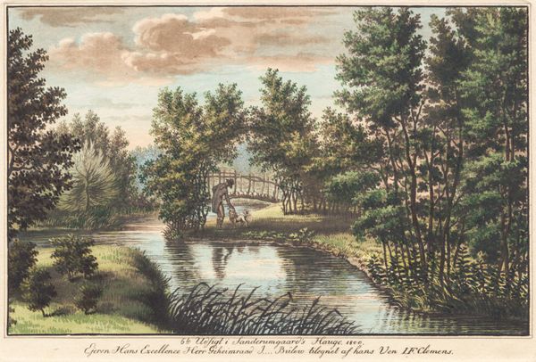
aquatint, coloured-pencil, print, etching, watercolor
#
aquatint
#
coloured-pencil
# print
#
etching
#
landscape
#
watercolor
#
coloured pencil
#
romanticism
#
watercolour illustration
#
watercolor
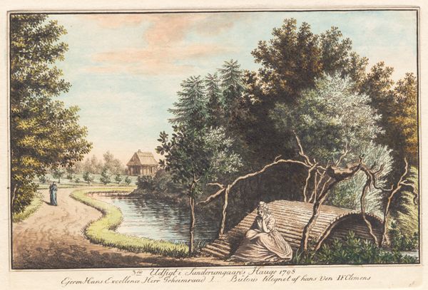
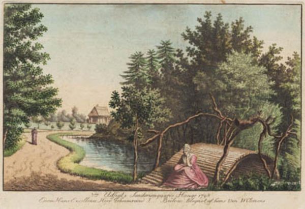
Dimensions: 151 mm (height) x 210 mm (width) (bladmaal), 115 mm (height) x 168 mm (width) (plademaal), 104 mm (height) x 165 mm (width) (billedmaal)
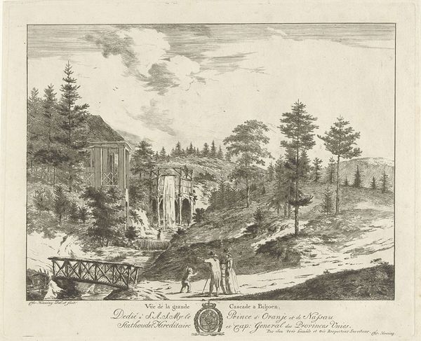
Curator: What a charming scene! This is "Sanderumgaards have 1," a work from 1798 by J.F. Clemens, currently held at the SMK - Statens Museum for Kunst. It combines etching, aquatint, watercolour and coloured pencil, creating a delicate and intriguing landscape. Editor: Delicate indeed! The pastel shades and detailed linework create an almost dreamlike setting. It’s a strangely calming composition, with just a touch of melancholic air. What’s your take? Curator: It definitely carries that late 18th-century sensibility – that hint of melancholy layered with the picturesque! Clemens expertly uses the different media, etching providing structure and watercolour and coloured pencil adding a romantic, soft light. You know, Clemens often created these prints as gifts, or mementos. I think it gives an intimacy to the landscape; we’re not just seeing the place, we are seeing his experience of the place too. Editor: The "experience" as labor. I'm drawn to thinking about Clemens as a maker; aquatint particularly is a labor-intensive medium. Imagine the time taken to etch the plates, acid-bite, ink and wipe to achieve those subtle tonal variations. The collaborative aspect is key to note also - how did his "friends" at court respond to Clemens work, and how in turn was he financially impacted? The "picturesque" often hides the sweat, toil, and collaboration behind its manufacture, but with art you must look further to understand what it *really* represents, or meant at that point. Curator: I couldn’t agree more! It is easy to be lulled by the Romanticism, the attractive colors – it truly exemplifies that movement in its focus on feeling and subjective experience. Still, what is even more fascinating is this combination of refined artistic practice – etching, aquatint – coupled with what are often viewed as domestic, perhaps even feminine materials: watercolours, coloured pencil! I mean, he creates such a gentle contrast! Editor: Absolutely, a challenging, albeit gentle contrast of methods for sure, speaking perhaps of changing material hierarchies, which, I would argue, are deeply connected to power and taste at the time, no? To examine Clemens landscape art is to also scrutinise materials themselves. What can they show? Curator: You have given me a new sense of clarity there! I love how one small artwork can reflect and challenge society. Editor: Absolutely - looking is not enough. The labour *is* the art.
Comments
No comments
Be the first to comment and join the conversation on the ultimate creative platform.
More like this