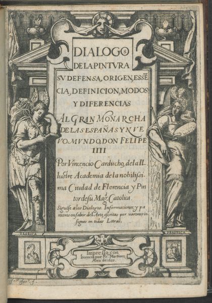
graphic-art, print, engraving
#
graphic-art
#
allegory
#
baroque
# print
#
pen-ink sketch
#
history-painting
#
engraving
Dimensions: height 157 mm, width 91 mm
Copyright: Rijks Museum: Open Domain
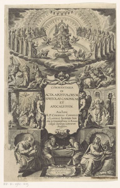
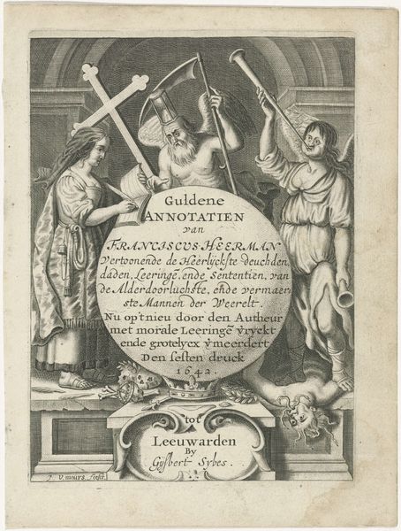
Curator: Here we have "Titelprent voor Typus occasionis in quo receptae commoda," a 1603 engraving by Theodoor Galle. Editor: It's… crowded, isn’t it? Visually quite busy, with so many figures crammed into the frame, a flurry of symbolic imagery competing for attention. Curator: It's classic Baroque, thriving on detail. What’s compelling to me is how the printmaking process itself informs the meaning. Galle, working in Antwerp, relied on copperplate engraving, a skilled craft requiring intense labor and a whole workshop of production. The availability of this kind of affordable printed material absolutely changed visual culture at the time. Editor: Absolutely. The fact that it's a print, reproducible and distributable, is central to its function as an allegorical and moral lesson. Look at how this image plays into the anxieties of its period! The way societal concerns are literally etched into copper and then replicated—it speaks to the power of imagery in shaping public discourse, and Galle's role within it. Curator: Consider also the skill required for this kind of line work, to produce an allegory accessible to a broad public through the reproducible media of engraving, challenges elitist notions about the supposed split between 'high art' and craft production. It reminds me that there’s still art, but this artwork presents art as part of a larger system of labor and dissemination. Editor: Precisely! The print itself acts as a historical artifact of social engagement. It reflects anxieties and desires and perpetuates certain socio-political positions of the Church by way of circulating widely and becoming embedded into people’s consciousness. A constant presence of reminder. Curator: Galle had to design this so it was legible not just intellectually, but also through material means—the density of the lines, the clarity of the symbols that he can represent at this small scale. Editor: An intriguing object, really showing that something made of base materials—copper, ink, and paper—can rise to become an index to early 17th century European anxieties and visual tastes. Curator: Exactly. Thinking about its initial social impact allows us to appreciate its visual cleverness that way the design and execution of such detail conveys its message.
Comments
No comments
Be the first to comment and join the conversation on the ultimate creative platform.
More like this