narrative-art
comic strip
comic
Dimensions: height 400 mm, width 269 mm
Copyright: Rijks Museum: Open Domain
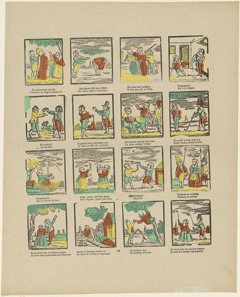
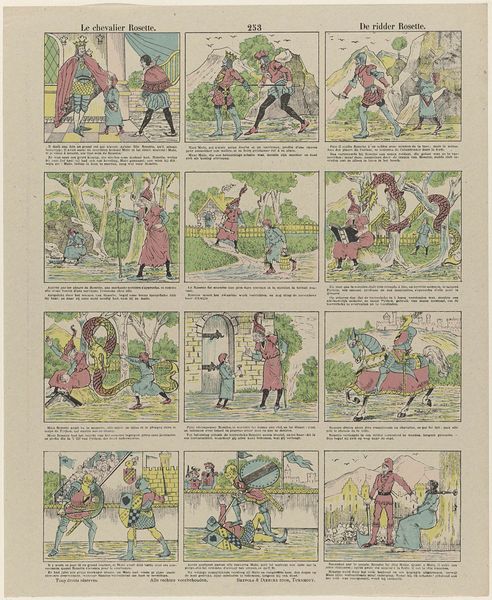
This small print called "De aanval op den molen" which translates to "The Attack on the Mill" by Monogrammist G.J., looks like it was made using some kind of printing press, maybe lithography with added colour. I’m already thinking about how the production of images changes what they can be! Here, the printmaker seems to be going for a simple, graphic style. The colours are flat, and the lines are clear, giving the whole scene a comic book feel. But notice how the figures are all slightly different. You can see the hand of the artist guiding the mechanical process, which makes the overall impression feel very warm and familiar. What reminds me most of this piece is the work of Philip Guston, who also embraced a cartoonish style later in life. Both artists show us that art doesn't always have to be serious or realistic to be meaningful; sometimes, the most profound truths are hidden in plain sight, disguised as something simple and accessible.
Comments
No comments
Be the first to comment and join the conversation on the ultimate creative platform.