print, engraving
#
portrait
#
aged paper
#
homemade paper
# print
#
hand-drawn typeface
#
fading type
#
thick font
#
white font
#
history-painting
#
handwritten font
#
academic-art
#
thin font
#
engraving
#
realism
#
historical font
#
small font
Dimensions: height 186 mm, width 140 mm
Copyright: Rijks Museum: Open Domain
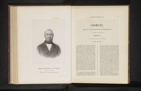
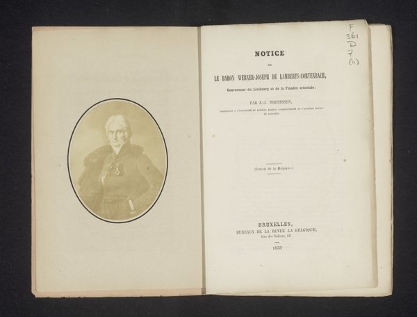
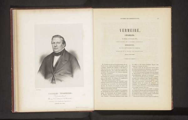
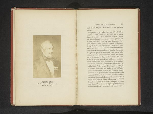
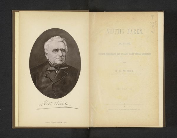
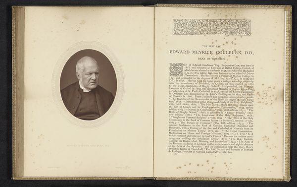
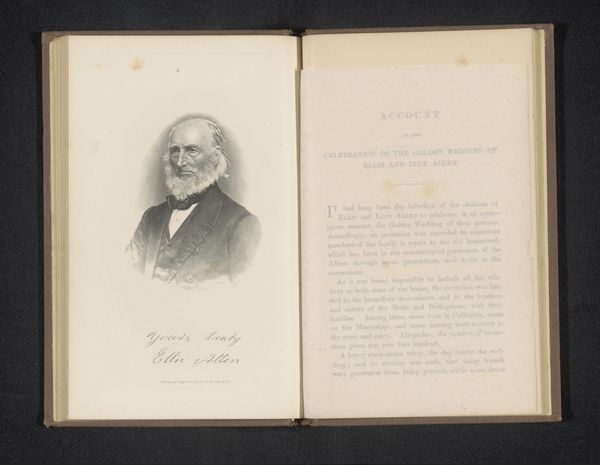
Editor: This print from before 1858 is called "Reproductie van een foto van een portret van Joseph Jouret" by Henri Borremans. It is displayed in an open book, showing both a portrait on the left and descriptive text on the right. What initially strikes me is the stark contrast in texture: the smoothness of the portrait against the dense typography. How do you interpret this work focusing on its visual composition? Curator: Focusing on the composition, consider how the stark black and white print flattens the image, emphasizing lines and shapes. Note the clear division of the book: portrait on the left, text on the right. How does this structured arrangement guide your eye? The engraving's detail, the subject's attire, juxtapose with the linear rigidity of the text. It's an intentional tension. Editor: The tension you mentioned seems intentional. What can we infer from the specific visual choices made? The texture contrast you emphasized seems key, how does it contribute to our understanding? Curator: Observe how the engraved portrait employs hatching and cross-hatching to suggest depth and volume, a clear intention to realistically depict Jouret’s features and clothing. Conversely, the dense typography on the opposite page exhibits an almost monolithic quality, lacking such subtleties. Ask yourself, what effect does the lack of visual gradation create for the viewer? It directs our focus: a realistic portrayal of a subject. Editor: So the lack of depth in typography enhances the realistic nature of the portrait? This really influences the perspective. Is there anything else we can say about this juxtaposition? Curator: Indeed. Consider the handwritten fonts. It further emphasizes the distinction. Thick versus thin, fading versus strong, small versus larger type. Each contrast reinforces the carefully constructed visual language of this work, doesn't it? These visual elements converge, dictating how the image communicates, before historical contexts. Editor: Thank you! That helps me appreciate the interplay of texture and composition, revealing layers I hadn't noticed at first. It gives a great understanding. Curator: It was a pleasure illuminating these formal elements. Seeing the image’s internal relationships lets the piece resonate more profoundly.
Comments
No comments
Be the first to comment and join the conversation on the ultimate creative platform.
More like this