painting, oil-paint
#
fauvism
#
sky
#
painting
#
oil-paint
#
landscape
#
acrylic on canvas
#
cityscape
#
expressionist
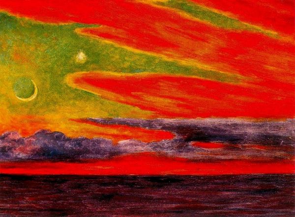
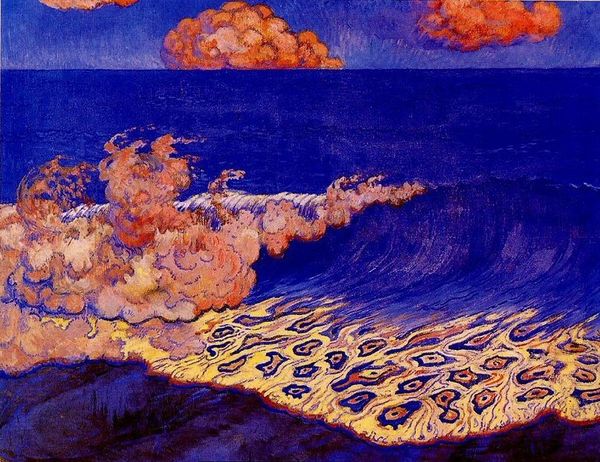
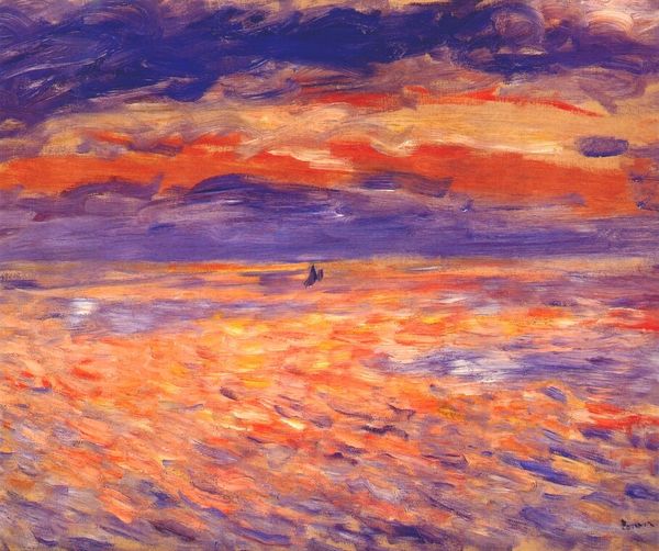
Dimensions: 80 x 99 cm
Copyright: Public domain US
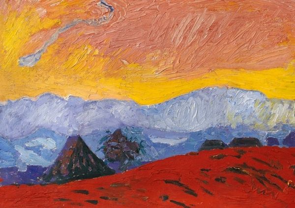
Curator: Before us is André Derain's "Effect of Sun on the Water, London," painted in 1906, a pivotal example of his Fauvist explorations. What are your initial impressions? Editor: The immediate impact is pure, almost jarring, colour. The vermillion sky, that almost pulsating orange reflection on the water. It's…visceral. It disrupts the expected serenity of a waterscape. I’m curious about the materiality of these choices. Curator: Indeed. Derain's deliberate use of non-naturalistic colour is central. The work operates less as a mimetic representation of London and more as a study in the expressive potential of colour itself. Notice the juxtaposition of the fiery reds and oranges with the cooler blues and greens – a deliberate act. Editor: I see that the pigment application looks so rapid. This makes me wonder if the production itself was trying to challenge traditional modes? Is the loose handling and these deliberate bold hues a reference to industrial life and growing factories or docks in London? The sun is working hard here! Curator: Intriguing point. While the speed and the almost impulsive application of paint contribute to the work’s dynamic energy, I'd argue that it speaks to a broader Fauvist ambition: liberating colour from its descriptive function. Derain is concerned not with depicting London accurately, but with evoking a sensation through colour relationships. The clouds also mimic fire... are they clouds or plumes? Editor: And that reflection - so fractured, and roughly applied, hinting towards the commercial reality of quick trades and growing industry. Was Derain exploring class tensions or merely capturing how rapidly the landscape of the Thames transformed through industry, the result visible from the very river and skies themselves? I think that matters deeply. Curator: It’s valid to read social context into the painting, but to focus on formal composition, observe the structure - horizon divides the fiery heavens from the water, anchoring this colouristic explosion, adding some necessary, visual structure. Editor: I still think these are industrial colours: coal, oil and fire, rather than sun-drenched. However you wish to look at it, his chosen application makes all of that matter. I cannot imagine such bright choice merely representing “sun.” Curator: Whether it’s about representing sunshine itself or factory smoke – looking through this piece we can consider materiality and artistic style. Editor: It really speaks to material's ability to shift, and create dynamic, visual statements.
Comments
No comments
Be the first to comment and join the conversation on the ultimate creative platform.
More like this