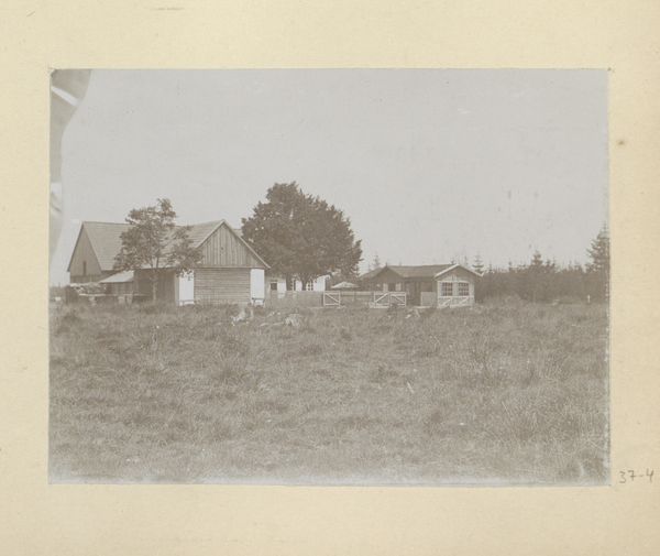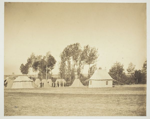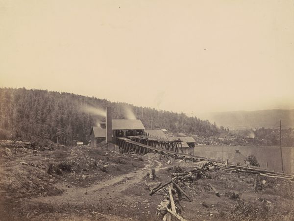
before 1894
Dorpsgezicht
Listen to curator's interpretation
Curatorial notes
Curator: Before us we have Hendrik Herman van den Berg's photography titled "Dorpsgezicht," believed to be captured prior to 1894. Editor: A melancholic mood permeates this photograph. The hazy tonality and broad field give a sense of quiet isolation, despite the presence of buildings. Curator: Indeed, the use of muted tones and soft focus aligns with Pictorialist aesthetics. We see how the artist uses photography to evoke an atmospheric painting, blurring sharp detail to prioritize overall feeling. Editor: I’m intrigued by how the buildings are situated. The composition leads the eye gradually from the structures on the left towards the seemingly unified mass towards the center and the right. It appears the community’s architecture blends into its environmental backdrop, particularly its position and use of surrounding forest. What does this proximity of habitation suggest about humanity's early relationship to land? Curator: Historically, this image might capture a shift. Perhaps, this shows a transition towards settlement as communities adapted or developed around specific geographies. Van den Berg seems conscious of that tension. Note the horizontality achieved through composition and the layering that speaks volumes—land, architecture, landscape. The eye encounters several planar surfaces rather than clear figures set against neutral expanses. Editor: Right! The artist, rather, plays with ambiguity here. The textures seem so blended. One sees these planes without a feeling of clear differentiation. Van den Berg offers no grand narrative of dominion or of settlement, but renders us into a soft, faded experience. I notice that while each structure differs somewhat, each makes heavy use of visible wooden structural elements. How might these details speak to available materials, craftsmanship, and resource distribution? Curator: That’s quite astute. Examining available resources, like the extensive timber around this environment, makes for better analyses around construction methodologies during this era and suggests the local communities employed vernacular construction, favoring materials from the nearby forests to build. It’s worth remembering that photographic methods would have presented material considerations. The tones achievable through processing and printing choices reinforce these readings. Editor: Seeing “Dorpsgezicht” has really prompted a more comprehensive awareness of what a study in tonality can deliver in its atmospheric expression. I’m particularly taken by how a subdued palette doesn’t necessarily diminish visual appeal, instead it often contributes profoundly to how we see the history held within artistic interpretation. Curator: And by paying closer attention to its visual design elements and production value—line, balance, tone—we glean insight into artistic intentions, thus heightening our comprehension about its moment in history.