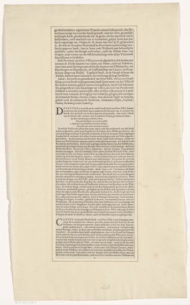
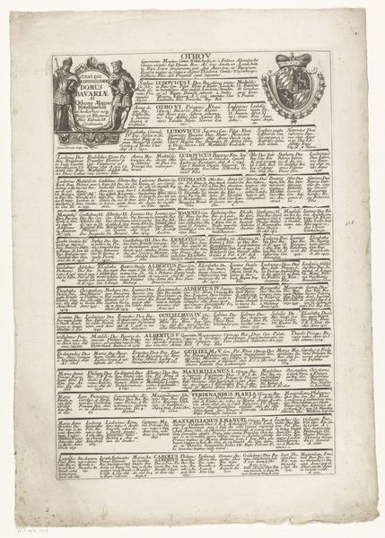
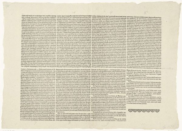
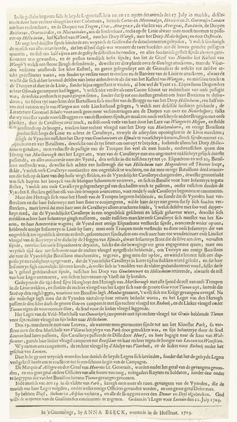
Beschrijving van de provincie Overijssel door Wilhelm Nagge (eerste pagina) after 1647
0:00
0:00
drawing, print, textile, paper, engraving
#
portrait
#
drawing
# print
#
landscape
#
textile
#
paper
#
group-portraits
#
history-painting
#
academic-art
#
engraving
Dimensions: height 438 mm, width 160 mm
Copyright: Rijks Museum: Open Domain
Curator: This engraving, "Beschrijving van de provincie Overijssel door Wilhelm Nagge", or “Description of the province Overijssel by Wilhelm Nagge," made after 1647, is interesting, particularly because it's the first page. What are your initial thoughts? Editor: Overwhelming. My eyes don't quite know where to rest. There's the ornate "O" at the beginning of the text block, but mostly it's a sea of words in tight formation. Intimidating, almost like a contract. Curator: In some ways, that's not far from the truth. Think about this existing during a period of tremendous reshaping of political landscapes. This "description" has power. It isn’t simply a factual report but is imbued with the politics of place. Editor: The script, so formal, reinforces that authoritative feeling. Looking closer, even that decorated initial “O” feels more about conveying established power than offering any actual illumination or decoration to the document. It anchors it visually, signaling a tradition and established cultural order. Curator: Indeed, it invokes a sense of civic pride and order, essential for administrating and maintaining power during the shifting alliances and burgeoning mercantile era of the Dutch Republic. Its visual language reinforced claims to legitimacy and historical continuity. Editor: So, an early form of branding, you could argue, where the province of Overijssel sought to present itself as stable, legitimate and important player on the political and economic stage. How fascinating that these bureaucratic documents doubled as symbolic statements. Curator: Absolutely. We are reminded that even seemingly simple documents were entangled with the larger sociopolitical narratives of their time. It encourages me to ask, who would have had access to this description? How would this engraving function within Dutch society? Editor: And seeing the history encoded, like a message in a bottle—reminds me of how meaning is layered, revealed and interpreted across centuries. The careful lettering becomes less like text and more like an emblem of stability in an unstable world.
Comments
No comments
Be the first to comment and join the conversation on the ultimate creative platform.
More like this