drawing, paper, pencil
#
portrait
#
drawing
#
paper
#
pencil
#
academic-art
Copyright: Public Domain: Artvee
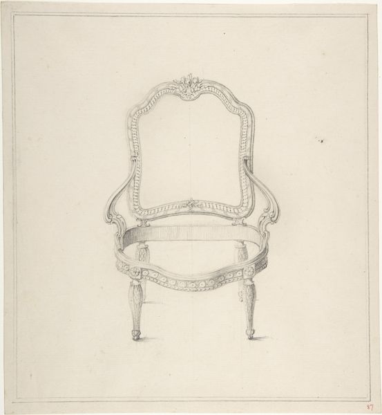
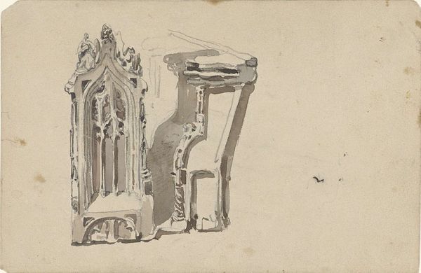
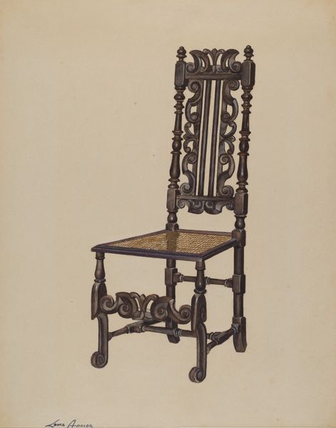
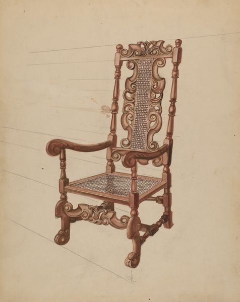
Editor: This is Johann Peter Krafft's "Study of a Chair Back," rendered in pencil on paper. It has an old feel with a sort of unfinished quality about it. It also strikes me as remarkably detailed for a preliminary study. What stands out to you, especially regarding the composition itself? Curator: Thank you. Focusing solely on its visual components, observe how Krafft orchestrates a dialogue between precision and suggestion. The architectural rigor of the chair's frame is evident, defined by clean lines, and precise angles, particularly at the bottom. Yet, note how these edges contrast with the haziness of the seat. Do you see how the velvety shading suggests volume? Editor: Yes, it gives the seat a plush look, very different from the hard frame of the chair. So the contrast adds depth to the composition? Curator: Precisely. Also, look at the paper itself: the warm tone serves as a blank space but also subtly augments the play of light across the chair's back. Notice, too, how the upper portion is barren. Editor: Now that you mention it, the empty space at the top adds to the chair's almost lonely presence on the page. I hadn't considered how much the negative space contributes. Curator: Yes, negative space acts almost as a compositional counterpoint to the intricacy of the structure, creating balance and highlighting the subject. Consider how the medium—pencil—enables a study of both texture and form. Editor: So, the combination of technique and materiality creates a multi-layered visual experience, drawing attention to both what is represented and how it's represented? Thank you. Curator: Precisely. This is also an art that trains us to look—to consider line, composition, balance—which allows the mind to better understand forms of all kinds. It has been a delight to share this observation with you.
Comments
No comments
Be the first to comment and join the conversation on the ultimate creative platform.
More like this