print, poster
#
art-deco
# print
#
geometric
#
cityscape
#
poster
Copyright: Public Domain: Artvee
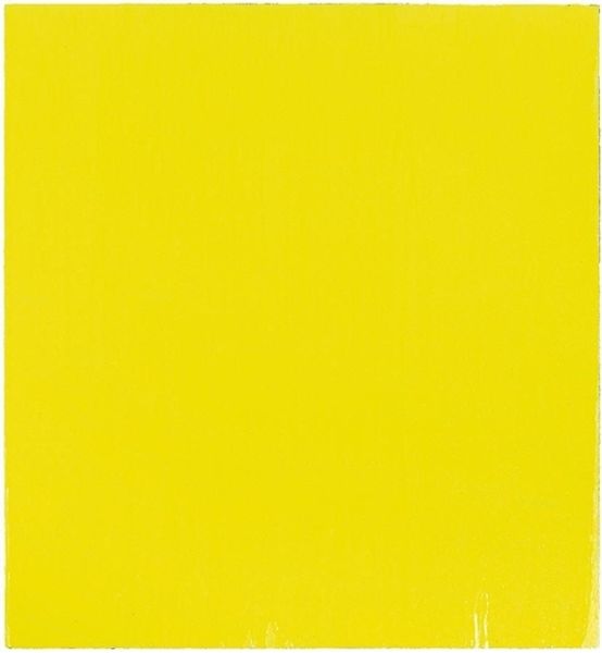
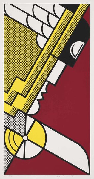
Edward McKnight Kauffer made this advertisement poster for the Daily Herald, and it's a great example of how graphic design thinks about shapes and colors. The dynamism of this print is achieved through a very limited palette. Look at how the artist balances the birds in flight against the large yellow block that they soar from. By simplifying the birds into geometric shapes, Kauffer captures a sense of forward motion. There's a real energy to the diagonals, which contrast nicely against the block colour behind. There's a kind of optimism to this early bird image. Maybe Kauffer was looking at Italian Futurism, which was all about speed and the modern world. But he brings his own spin, a sense of streamlined simplicity. Art is always a remix, an ongoing conversation. It's not about having the final word, but about keeping the dialogue going.
Comments
No comments
Be the first to comment and join the conversation on the ultimate creative platform.
More like this