print, relief, sculpture, engraving
#
neoclacissism
#
allegory
# print
#
sculpture
#
relief
#
figuration
#
geometric
#
sculpture
#
history-painting
#
engraving
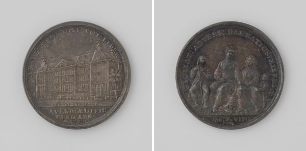
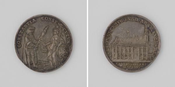
Dimensions: diameter 2.7 cm, weight 7.10 gr
Copyright: Rijks Museum: Open Domain
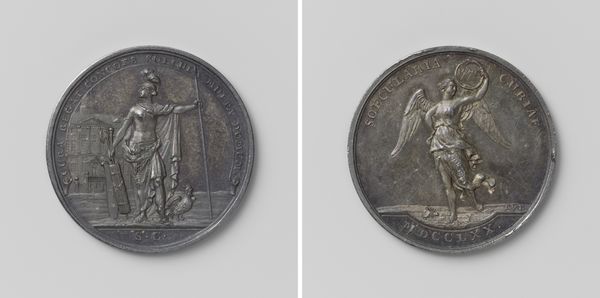
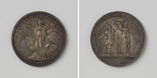
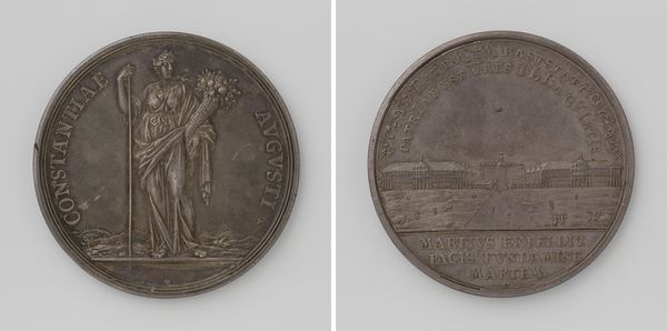
Curator: This striking medal is known as the 'Vroedschapspenning van de stad 's-Hertogenbosch,' created in 1793 by Theodorus Victor van Berckel. It presents a fascinating insight into the political climate of the time, cast in the then-popular neoclassical style. Editor: It's cold, and austere. I immediately notice the limited tonal range of the print – nearly monochrome, emphasizing texture and form over color. The very physical creation of the medal would demand skilled craftspeople to carve these complex reliefs, likely with very specialized tools. Curator: Indeed. The medal format itself played a crucial role. Cities would commission medals like these to commemorate historical events or important local happenings and to project an image of power and stability. Consider this one as an element in the city's broader branding efforts. Editor: The way the scenes are designed reminds me of other, perhaps more luxurious forms of production in metal like watch faces or even larger decorative friezes on buildings. This begs the question, what were the material considerations for wide circulation? And to whom would these be available, outside the ruling class? Curator: A great point! This example depicts allegorical figures that resonate with enlightenment ideals and a desire for civic virtue, but these images are deeply embedded within networks of patronage. They reinforce established hierarchies even as they borrow the language of republicanism. It presents a particular paradox in Dutch history during this period. Editor: The composition also reveals clues about social practice; on one side, a reclined figure amidst a landscape… probably Father Maas? It evokes a strong sense of place, of grounding in material reality and resources. The flipside is almost clinical, the figure of justice seems so formal against what I believe is the town hall. Curator: Precisely, both faces aim to construct a narrative. The watery visage and settlement scenery showcase the city’s location and trade routes, while the figures Justice and Virtue emphasize moral authority within 's-Hertogenbosch’s political structures, a narrative crafted and promoted by city elites. Editor: And thinking of labor—how many hands touched this medal? The artist, the engraver, distributors… even people who handled the money to pay for its production. Each adds a layer to understanding not just what it depicts, but what the thing IS. Curator: By examining its circulation and symbolic language, this seemingly small object becomes a powerful lens for understanding civic identity and the complexities of power relations during the late 18th century. Editor: Exactly. Looking beyond the artistry, scrutinizing the process, opens us up to histories far exceeding a single image or icon.
Comments
No comments
Be the first to comment and join the conversation on the ultimate creative platform.
More like this