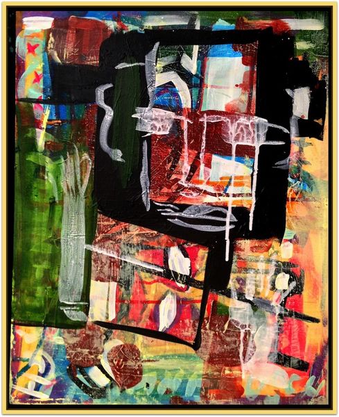
Dimensions: image: 922 x 920 mm
Copyright: © Gillian Ayres | CC-BY-NC-ND 4.0 DEED, Photo: Tate
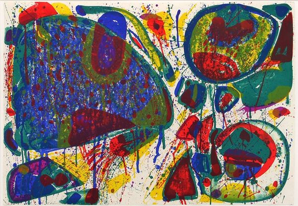
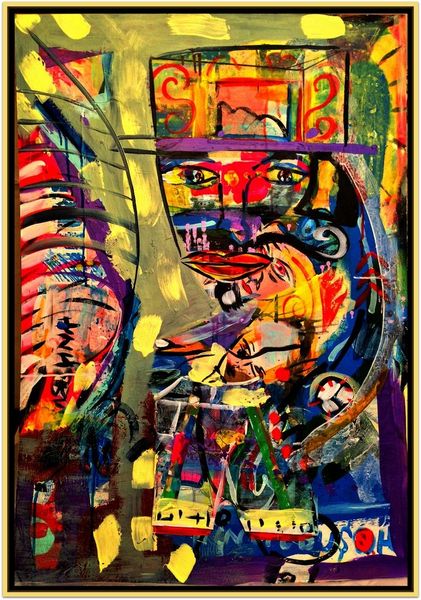
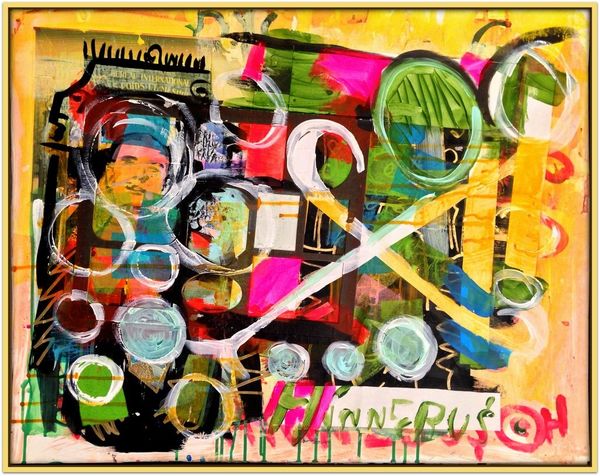
Curator: Gillian Ayres's "The Colour That Was There," held in the Tate Collections, presents a fascinating study in form and chromatic interaction. Editor: My first thought? Playground! It feels chaotic, but in a joyful, energetic way. Curator: Note how Ayres utilizes the square format to create a contained yet dynamic composition. The interplay of bold colours, primarily blues and yellows, establishes a visual rhythm, disrupting conventional figure-ground relationships. Editor: It's like she's not afraid of anything. These shapes, they're just there, doing their thing. I'm wondering if she was channeling a memory, maybe a place. Curator: Indeed, the title hints at memory and abstraction. The brushstrokes themselves convey a sense of immediacy, but also a deliberate construction of visual space. Editor: You know, stepping back, I feel a sense of openness. A freedom to see whatever I want in it. Curator: Precisely, the artwork operates as an open system, inviting interpretation through its formal elements. Editor: It's a bold statement about color, isn't it? That something so simple can hold so much. Curator: Yes, through colour and form, Ayres offers us a window into pure visual experience.
Comments
http://www.tate.org.uk/art/artworks/ayres-the-colour-that-was-there-t07118
Join the conversation
Join millions of artists and users on Artera today and experience the ultimate creative platform.
For The Colour That Was There, Ayres took a proof of a screenprint she had rejected, and painted over it using acrylic paint (a medium she had given up in favour of oil some years earlier). The shift in medium complicates the spatial dynamic of the composition, additionally defined by the decorative painted border around its four edges, emphasising the work’s self-contained nature. The title could refer to the original screenprint, which may have been differently coloured, or perhaps to a colour that was obscured when Ayres painted over the print. Gallery label, October 2019