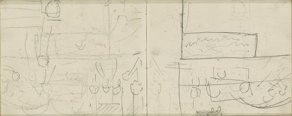
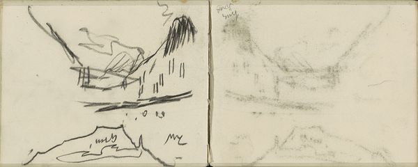
Schrijvende hand en de Tesselschadekerk te Hilversum 1884 - 1952
0:00
0:00
drawing, paper, ink
#
drawing
#
comic strip sketch
#
imaginative character sketch
#
quirky sketch
#
paper
#
personal sketchbook
#
ink
#
idea generation sketch
#
sketchwork
#
ink drawing experimentation
#
sketch
#
abstraction
#
sketchbook drawing
#
cityscape
#
storyboard and sketchbook work
#
sketchbook art
Dimensions: height 84 mm, width 111 mm
Copyright: Rijks Museum: Open Domain
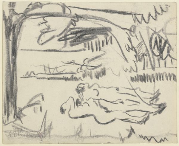
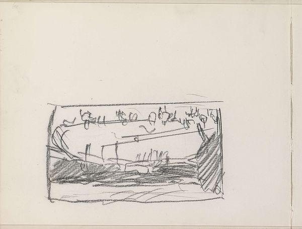
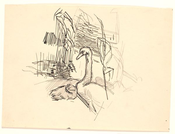
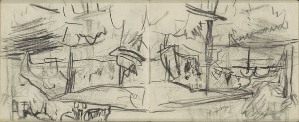
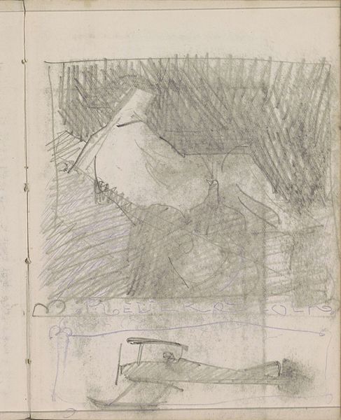
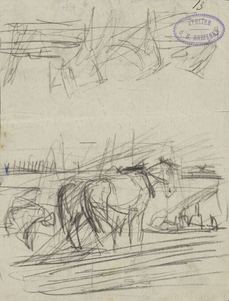
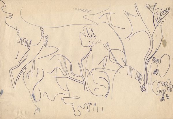
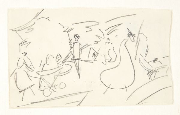
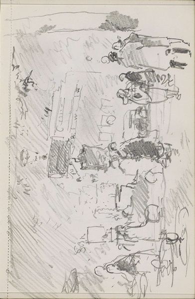
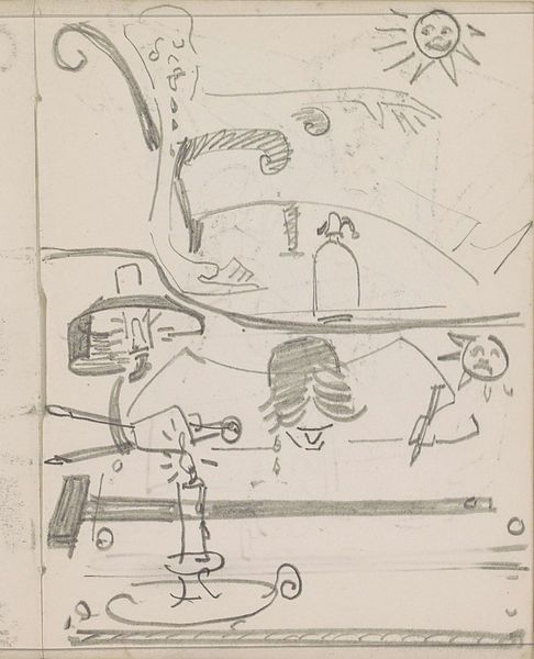
Editor: This is "Schrijvende hand en de Tesselschadekerk te Hilversum" – Writing Hand and the Tesselschade Church at Hilversum – a sketch made with ink on paper sometime between 1884 and 1952 by Reinier Willem Petrus de Vries. I'm struck by the artist’s quick, confident line work. What compositional elements stand out to you? Curator: The rapid, almost impulsive, application of ink generates an interesting interplay of line and form. Note how the spatial relationships are implied, not explicitly defined. The use of line weights and the hatching employed provide volume and shadow. It encourages us to analyze not what is depicted, but *how* it is depicted. Do you agree? Editor: Absolutely. The various images suggest the feel of turning pages in a notebook or sketchbook. There's no sense of needing to show off. The goal seems to be the recording of pure sensation. What are some examples you find most successful in that approach? Curator: Observe the rendering of the church, particularly the spire. The artist relies on a network of lines instead of solid forms. Note the juxtaposition of the architectural forms with the loose abstraction in other quadrants. These diverse approaches within the single work provide insight into de Vries’ artistic process. What is gained by fracturing and reframing representational material? Editor: I see. The fracturing pushes us to appreciate each image individually. But the recurring color choice also creates a visual link that draws them together, despite their dissimilarity. Curator: Precisely. We come to understand that, despite superficial variation, a rigorous logic of form and application underlies it all. This provides a conceptual unity that supersedes representational concerns. Editor: It's fascinating how focusing on the artist’s choices, the how rather than the what, opens up a deeper understanding of the piece. Curator: Indeed. Through attentive formal analysis, we begin to recognize the intrinsic qualities and intentions of the artist.
Comments
No comments
Be the first to comment and join the conversation on the ultimate creative platform.
More like this