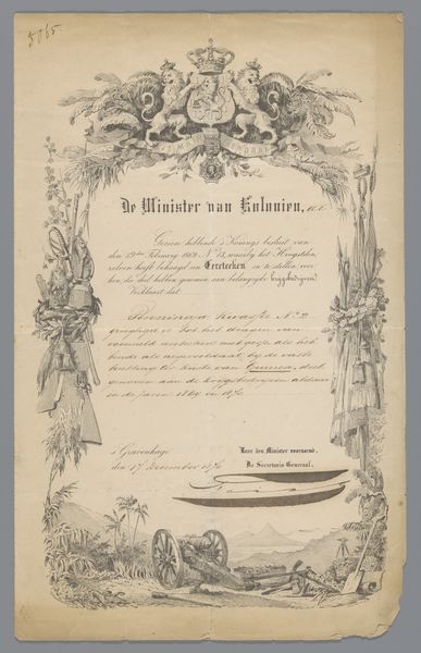
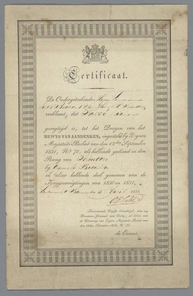
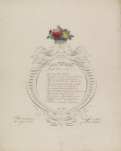
Lofdicht op de troonsbestijging van koning Willem II, 1840 1840 - 1841
0:00
0:00
gvonballerstedt
Rijksmuseum
drawing, print, ink, engraving
#
portrait
#
drawing
#
pen drawing
# print
#
ink
#
engraving
#
calligraphy
Dimensions: height 545 mm, width 400 mm
Copyright: Rijks Museum: Open Domain
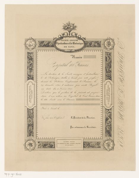
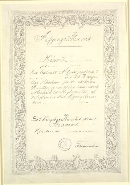
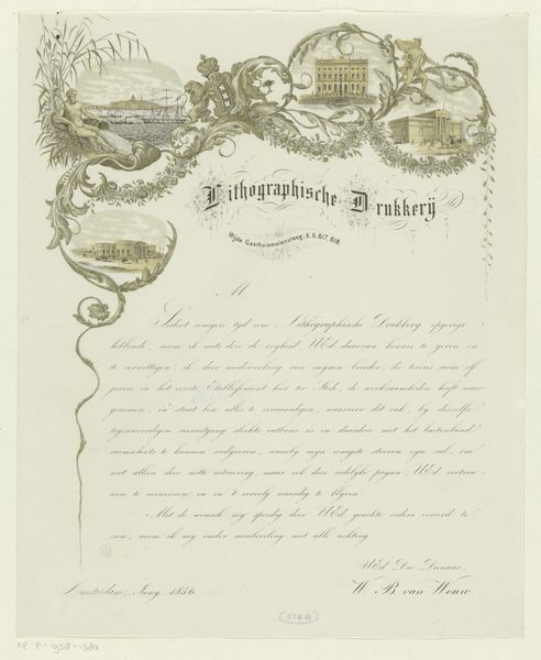
Curator: Welcome! We're looking at "Lofdicht op de troonsbestijging van koning Willem II," which translates to "Encomium on the Accession of King William II," a print dating from 1840 to 1841. The artist is G. von Ballerstedt, and it’s made with ink and engraving. Editor: Woah, it feels intensely ceremonial, doesn't it? All that intricate calligraphy forming a kind of…architectural frame around the text. Like a royal proclamation but whispered. It’s more suggestive than declarative. Curator: Indeed. These types of prints were incredibly common for important political or royal events. They served to disseminate information, promote the new sovereign, and instill a sense of patriotic feeling among the populace. The text is central here—a laudatory poem written to celebrate Willem II becoming king. Editor: And the frame… that’s where the real story seems to happen. The details – the crests, the vignettes… it all seems meticulously constructed to impress. It feels like political origami! Do you think ordinary people saw these or were they only aimed at the aristocracy? Curator: Good question. While they were publicly displayed, access and understanding were largely limited to literate members of society and those within political circles. These were tools of soft power and visual persuasion, designed to solidify the King’s image in the minds of the elite but also to trickle down as symbols of power to the lower classes. Editor: Makes you wonder how many people stopped and truly *read* the poem. Or did they just see "crown," "king," and get the overall vibe? Like a visual press release! I’m strangely fascinated by how carefully everything is arranged. Curator: It highlights how carefully the visual culture was engineered during such transitions. It wasn’t just about the King; it was about building a collective identity and projecting strength both internally and abroad. Editor: So much deliberate showmanship, from the crowns right down to the swirly details. Though now it all feels so old-fashioned. What feels authentic here – which might be surprising! – is that fragility of paper and ink that suggests all reigns are temporal. Curator: Absolutely. Seeing it today lets us dissect the intentions behind this regal messaging and appreciate the skillful deployment of symbolism to bolster political legitimacy in 19th century Netherlands. Editor: A beautiful testament to the old phrase that images can often speak louder than actual policy. Fascinating!
Comments
No comments
Be the first to comment and join the conversation on the ultimate creative platform.
More like this