neo-pop
Copyright: Modern Artists: Artvee
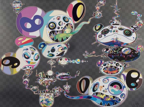
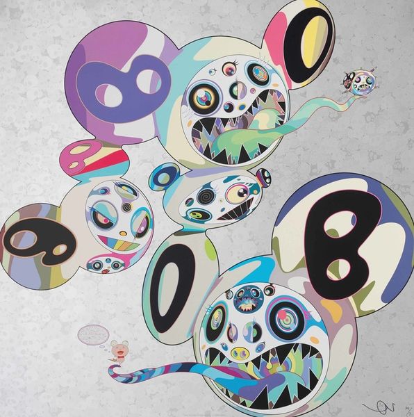
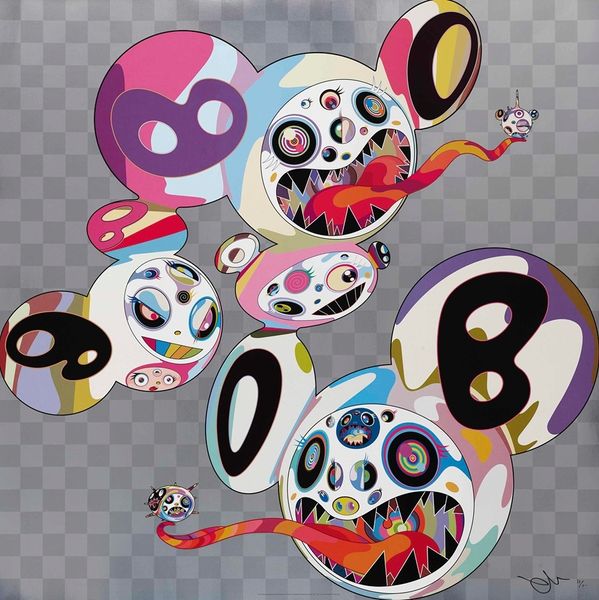
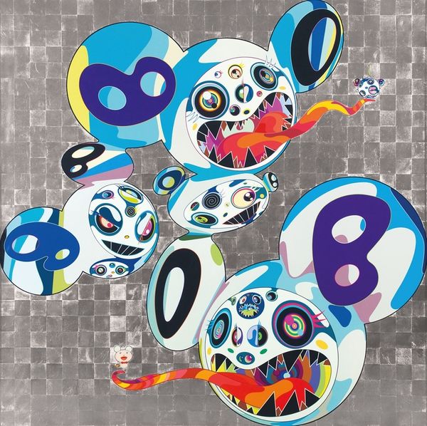
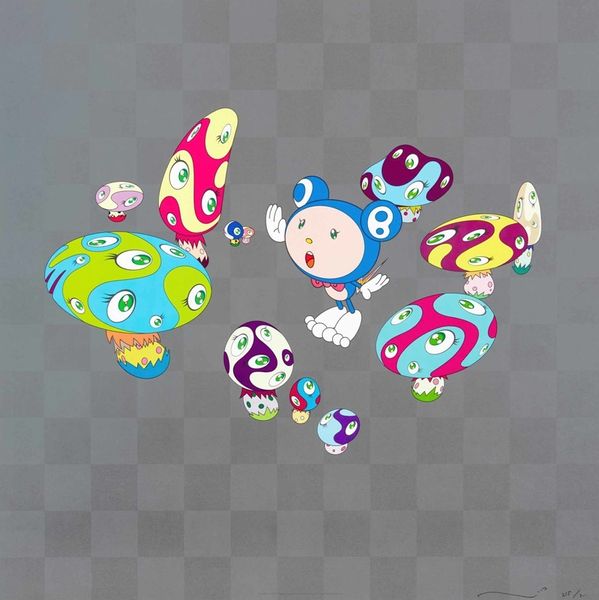
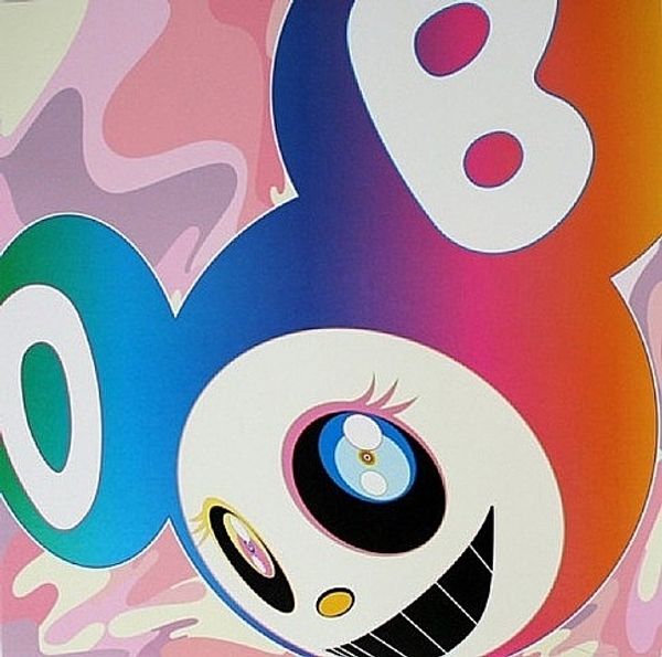
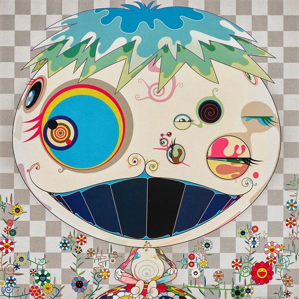
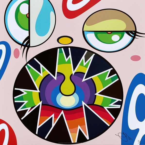
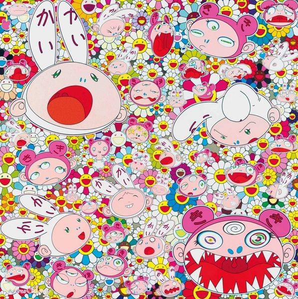
Curator: Let's take a look at Takashi Murakami's "Hands Clasped," created in 2015. It is made with acrylic paint. My first thought is a candy-colored explosion, almost overwhelming. What jumps out at you? Editor: It's… manic. The repetition of cartoonish figures, their distorted smiles and protruding tongues—they create a very unsettling landscape of childish imagery gone awry. The sheer number of them suggests a kind of relentless, inescapable… something. Curator: I’d say inescapable market. These characters are meticulously crafted in his studio, relying heavily on assistants. Think of the intense labor involved in rendering these seemingly simple forms with such precision. It's a calculated mass production aesthetic, mirroring consumer culture itself. The use of acrylics, chosen for their vibrant, consistent color, is crucial. They speak to the flat, graphic language of advertising and mass media. Editor: Yes, the materials themselves point to that flattened, commercial aesthetic, but consider the visual vocabulary Murakami employs. The wide, staring eyes, the toothy grins—they evoke not just cartoons but a kind of distorted, hyper-realized form of manga and anime, pulling at very specific threads of Japanese cultural identity and anxiety. Curator: It's a flattening, too, of high and low art. He is purposefully blurring the lines. And how is that different from, say, Warhol screen-printing soup cans, appropriating commonplace items, but Warhol used actual commercial silkscreen, and Murakami utilizes that studio of artists. Editor: Both using the language of everyday objects to say what about the culture which created it? To get closer to that, consider the ‘hands clasped’ implied within that central figure. It can express many feelings - apology, a plea, even hopefulness. But amidst this frenetic scene, does it ring hollow or take on some different, ironic tone? Curator: A mass produced apology might sound hollow, I think this really speaks to something in our world today: something about cultural production itself as a collaborative but highly controlled enterprise. The bright colours function as a lure, almost disguising a much darker process. Editor: A striking thought to end on: How playful forms can still provoke such complex conversations, how surfaces invite deeper questions. Curator: Agreed, these screaming colors also hold multiple stories and multiple processes, as we also begin to think about the artwork that emerges.
Comments
No comments
Be the first to comment and join the conversation on the ultimate creative platform.