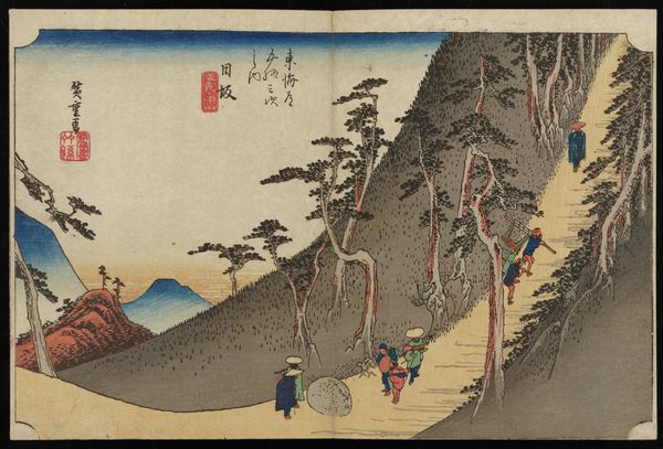
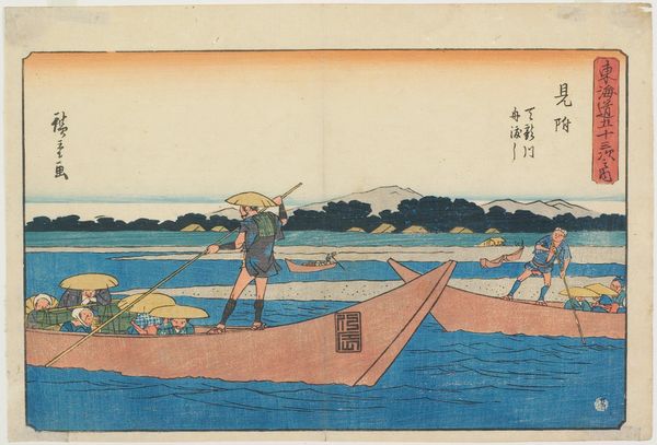
print, paper, ink, color-on-paper
#
toned paper
# print
#
landscape
#
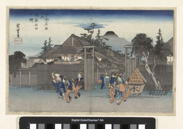
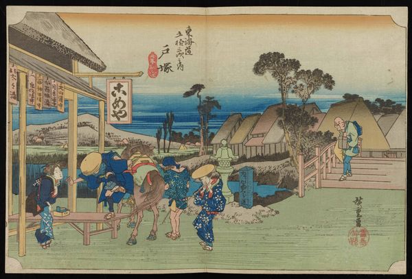
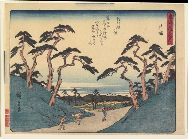
ukiyo-e
#
japan
#
paper
#
ink
#
color-on-paper
#
naive art
#
watercolour illustration
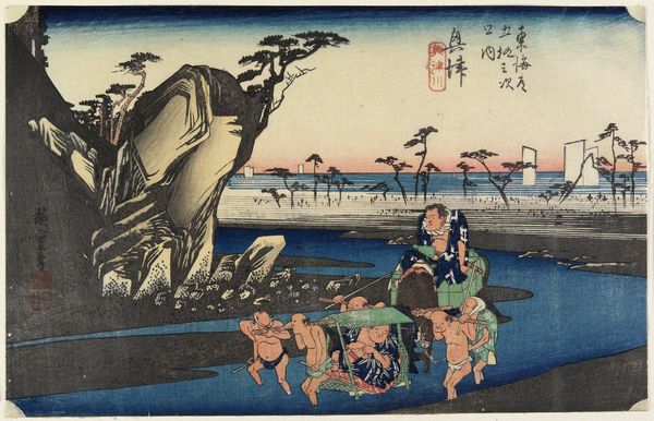
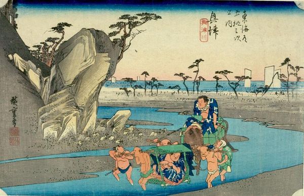
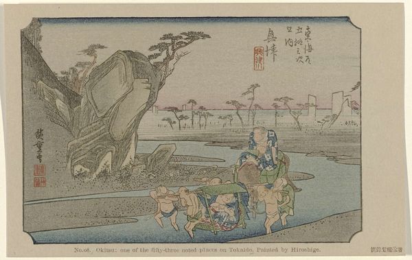
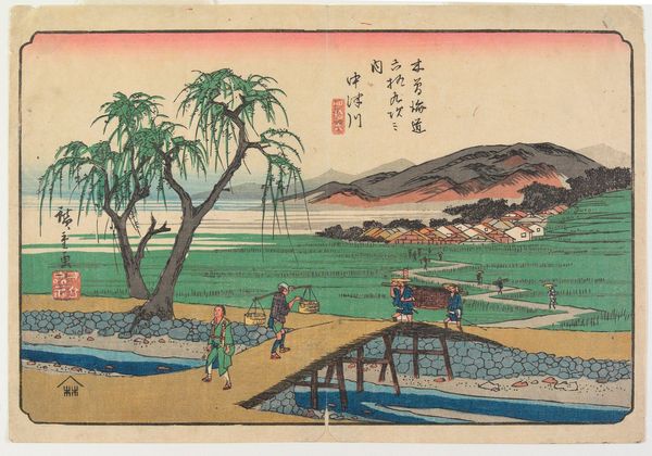
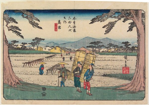
Dimensions: 9 1/2 × 14 1/4 in. (24.13 × 36.2 cm) (sheet, horizontal ōban)
Copyright: Public Domain
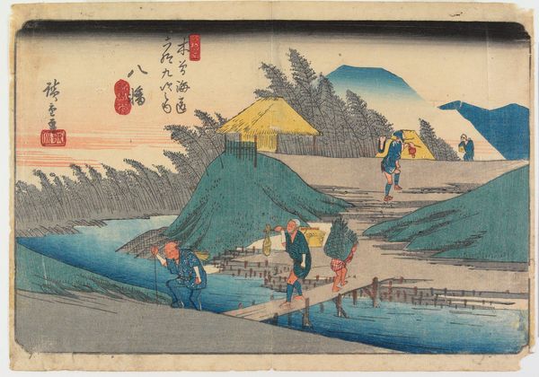
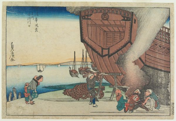
Editor: We’re looking at “Okitsu River” by Utagawa Hiroshige, made around 1832. It's a color woodblock print. The texture seems incredibly smooth despite the amount of detail packed into the composition. I'm especially interested in the geometric relationships created between the different clusters of people and objects within the picture plane. What compositional strategies are at work here? Curator: Observe how the artist structures the composition with linear perspective. The receding river creates orthogonal lines that lead the eye towards the horizon. Consider also the use of color—the vibrant blues of the water are juxtaposed with the earthier tones of the landscape and the pale tones of the sky. How do these colors contribute to the overall spatial construction? Editor: The figures definitely become smaller, which exaggerates depth. And I noticed the color variation helps create distinct planes as well. Curator: Exactly. Furthermore, consider the relationship between the shapes themselves. The large, imposing rock formation on the left is counterbalanced by the figures crossing the river. There’s a sense of equilibrium, achieved through contrasting forms. What is the significance of the varying heights? What effects do they create on you? Editor: So, he is setting up this tension and release, but what does it mean? I can see it, but I don't feel like I understand *why* the artist might construct this scene like this. Curator: Focus your analysis on the shapes themselves. The towering rock and spindly pine boughs reach in opposition, while a third diagonal is created by the roof of the kago [palanquin] that’s being carried. What meaning emerges from that interaction alone? Forget about context. Just tell me about the forms themselves, as objects on a 2D picture plane. Editor: Now I understand this method, because each of the shapes feels intentionally placed to pull your eye into the distance! And each provides a counterbalance, creating its own spatial pocket. Thank you. Curator: My pleasure. Looking beyond any cultural implications, we appreciate it now for its abstract design principles.
More like this