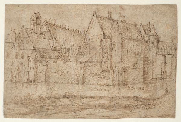
drawing, paper, ink
drawing
dutch-golden-age
landscape
paper
ink
pen-ink sketch
cityscape
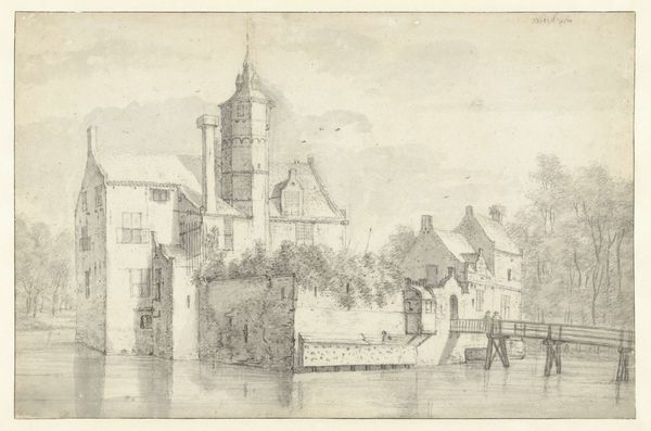
Dimensions: height 249 mm, width 395 mm
Copyright: Rijks Museum: Open Domain
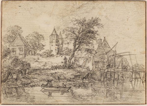
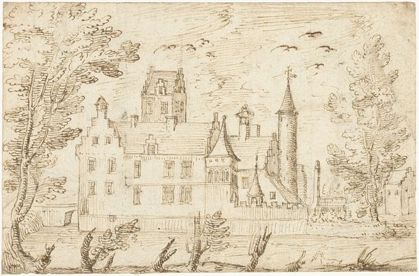
Curator: This is "View of Kleef," a pen and ink drawing by Jan Lievens, created in 1664. Editor: There's a sense of quiet industry to it, almost like a staged theater set with each building presented neatly and pragmatically. A brown monochrome sketch... but more somber than quaint. Curator: Somber is a good word. The drawing is made with broad strokes that nevertheless allow one to appreciate Lievens’ understanding of line and mass. The hatching in the shadowed areas and the almost frenetic, yet controlled, strokes that make up the trees are just remarkable. Note how the spire in the background pierces the scene. Editor: Indeed, and it pierces its viewers. Look at how the boats are nestled gently, lower down, in the scene. Then let your gaze ascend toward the imposing architectural mass, which certainly feels like a conscious placement to reflect the might of centralized power relative to the everyday Dutch life and landscape below. Curator: Yes, though its muted rendering, like the wisps of smoke, allows it to sit harmoniously within the scene. Rather than overpowering it, I'd argue. See the clever use of empty space, for instance. Editor: Perhaps. The empty space provides that separation, certainly. However, its imposing height and stylistic starkness still speak to an architecture that’s removed from the immediate reality of the town. It speaks of an establishment that looms, detached from the common person even within such domesticity. The buildings cascade to the waterline. There’s a dialogue here on socioeconomic levels. Curator: I appreciate that reading. To my eye, the appeal resides in the tension between the deliberate composition, with its contrasting textures and light, versus the looseness afforded by the drawing medium. Editor: Agreed. And within this, a social dialogue of controlled landscape versus implied power, that makes the Dutch Golden Age speak across the centuries to current times. Curator: An engaging set of social contrasts that perhaps overshadow Lievens skill. Thank you. Editor: Thank you. Another opportunity to consider power and aesthetic decisions.
Comments
No comments
Be the first to comment and join the conversation on the ultimate creative platform.