mixed-media
#
gouache
#
mixed-media
#
water colours
#
geometric
#
abstraction
#
pop-art
#
watercolor
Copyright: Michael Bolus,Fair Use
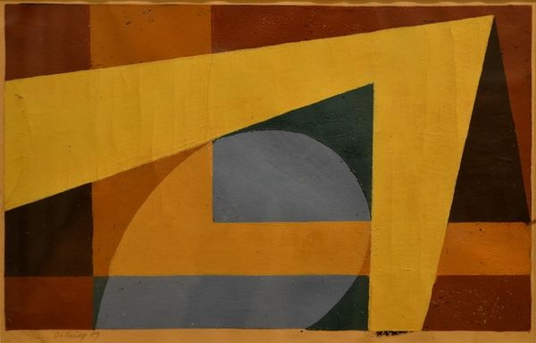
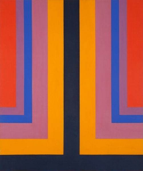
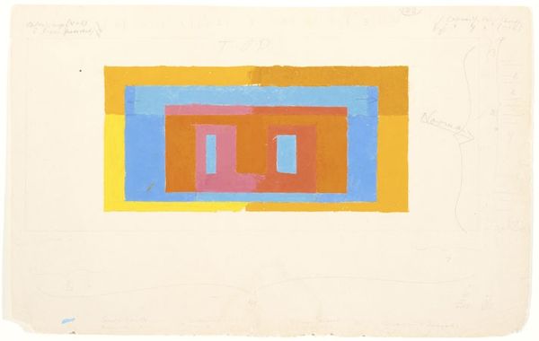
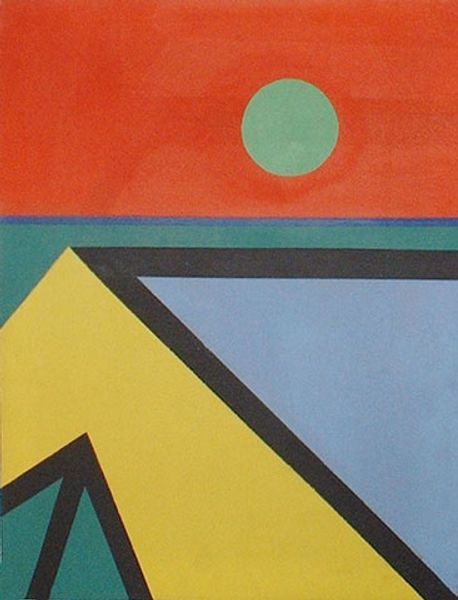
Curator: Immediately, the subdued tones of blue and terracotta orange set a contemplative mood for me. Editor: I'm drawn to the starkness of its construction, the deliberate choices of colour and the simple combination of shapes, and then a sort of rustic grounding, that rough texture in the base, creating this compelling sense of materiality. The use of materials hints at more than just the purely visual. Curator: Indeed. The artwork, titled "Bowbend," was completed in 1964 by Michael Bolus. The artist employs mixed-media techniques, incorporating both gouache and watercolors. Considering the title and its visual presence, do you interpret it as an attempt to represent spatial dimensions? Editor: Perhaps. But I am more captivated by its material quality. Mixed media work in that period often implied a negotiation between painting and sculpture, pushing the boundaries of the definition of art, involving also "everyday materials", which I don't really see represented in this particular artwork. Is it merely pigment? I’d like to examine its process further. The application of watercolor onto... something… I wish I knew more! Curator: The geometric shapes are not arbitrary; they invite contemplation, acting as building blocks, and creating new spatial relationships through simple combination. I detect visual continuity from this piece and early modernist symbols in his work. A kind of pared down iconic form. It evokes balance. Editor: That's interesting. To me, the interplay of geometric shapes hints at a Pop Art sensibility, which can be understood by observing that clear combination and placement of colours, the hard-edge application of paint to make the surface extremely uniform. What could Bolus be signaling with his selection of this seemingly contradictory palette? Curator: The ochre perhaps alludes to a kind of grounding, stability and longevity that stands in direct conflict with pop aesthetics! Overall I would venture a reading in the balance between progress and something immutable and solid. Editor: Thanks to you, I do too now. I am curious how it was all made—I mean that literally, like what the artistic labor looked like. Perhaps that can change the reading a bit more.
Comments
No comments
Be the first to comment and join the conversation on the ultimate creative platform.
More like this