#
type repetition
#
natural stone pattern
#
aged paper
#
homemade paper
#
detailed texture
#
paper texture
#
chalky texture
#
folded paper
#
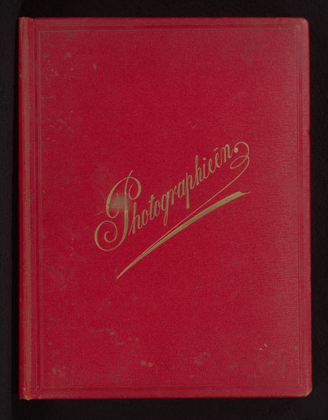
embossed
#
foil embossing
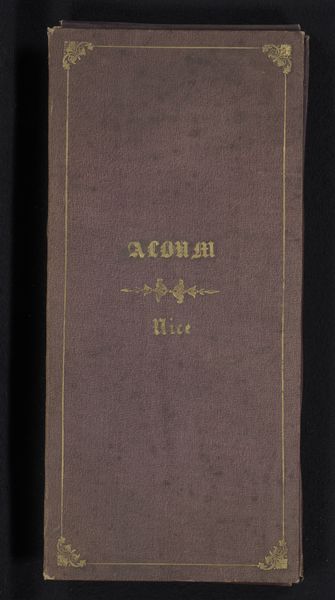
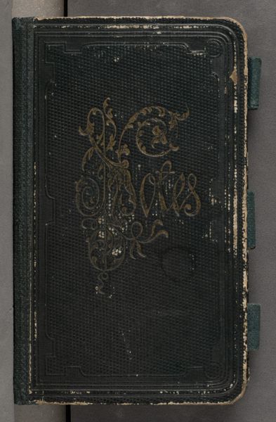
Dimensions: height 170 mm, width 106 mm, thickness 5 mm
Copyright: Rijks Museum: Open Domain
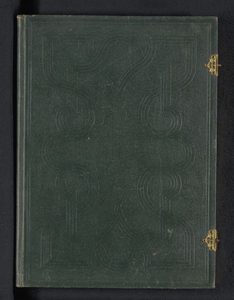
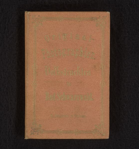
Curator: Here we have a fascinating piece, a book titled "An Rika: Frühlings-Gedanken," dating back to 1876 with the bookbinder W.E. Frowein. Editor: It strikes me as remarkably understated; the simple green cover with minimal gold embellishments is very dignified and the aged quality only enhances that feel. Curator: Indeed. The design echoes the Victorian era’s penchant for sentimental keepsakes and gift books. The gold foil embossing, along with the green, signifies a sort of natural reverence, or hope of renewal. We must think of the political climate; during this time in Europe and specifically Germany, literature and decorative pieces played a vital role in reinforcing nationalism and celebrating cultural heritage. Editor: From a design standpoint, the embossing creates lovely textural contrast on the book's cover. The matte quality of the green almost makes the gold pop, and I think that balance brings forward some of its intrinsic harmony. I wonder, how did this item arrive here? Was it collected privately or through institutional channels? Curator: Likely through private means initially. Many of these kinds of decorative volumes shifted hands through family lines. Eventually they may find themselves in archives that represent their historical worth as material culture artifacts. The very act of owning and preserving these books can indicate a dedication to cultural values or societal status. Editor: Right, so it's as much about what the book says as the very look and feel of its material presence. The aged look and decorative foil are very visually arresting in the way that they convey quality and significance. I now notice more details than previously registered - the quality of light on the aged paper, the fine embossing...it all adds to the overall dignity. Curator: Precisely. And understanding its circulation through society illuminates how ideas and tastes were distributed. Its design also suggests that "An Rika" probably speaks to a very specific audience—one literate and probably feminine given its theme of "Spring Thoughts", so thinking about social roles makes sense. Editor: It makes sense to end, noting how powerfully an artwork's simple details can point to the values we all bring to it - today and in the past. Curator: Agreed. Thank you for the look into craft and composition, they really speak to larger social meanings embedded into this object’s presence.
Comments
No comments
Be the first to comment and join the conversation on the ultimate creative platform.
More like this