graphic-art, print, engraving
#
graphic-art
#
hand-lettering
#
dutch-golden-age
# print
#
old engraving style
#
hand drawn type
#
hand lettering
#
text
#
hand-drawn typeface
#
fading type
#
stylized text
#
thick font
#
handwritten font
#
engraving
#
small lettering
Dimensions: height 168 mm, width 475 mm
Copyright: Rijks Museum: Open Domain
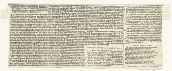
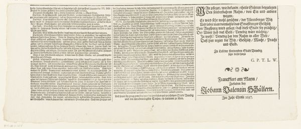
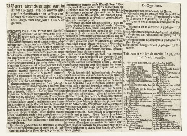
Curator: This printed text sheet, titled "Tekstblad bij een prent van de zeeslag bij Duins, 1639", was created around 1639-1640. It's currently held in the Rijksmuseum. My immediate impression is how meticulously detailed the lettering is. Editor: It's a striking example of graphic art from the Dutch Golden Age. The sheer density of text gives it an imposing, almost overwhelming, presence. What is it about? Curator: It serves as explanatory text related to a print depicting the Battle of the Downs, a significant naval battle. The text identifies ships, admirals, and provides context to understand the imagery in the associated print. Editor: So, the form and function are completely intertwined. The labour involved in engraving such small and precise lettering must have been significant, marking both the skill of the craftsman and perhaps, the perceived value of detailed, accessible information about a contemporary event. Curator: Absolutely. It demonstrates a desire to disseminate knowledge about current events to a wider audience. The choice of language, the layout… it’s all geared towards accessibility for those who read German. How the narrative is structured offers insight into contemporary perspectives on conflict and national identity, I'd say. Editor: I agree. And consider the materiality; this isn't just information, it's an object made to be circulated, consumed, perhaps even repurposed. It reflects the emerging culture of print and its impact on shaping public opinion. The handwritten fonts offer some personalization to the otherwise factual character of the text. Curator: Its small size allows the work to reach wider audiences and influence public perception regarding the war. I'm reminded of how power structures have throughout history used different forms of media, including text and imagery, to shape public consciousness and legitimize their actions. Editor: Looking at this piece highlights the social and material conditions of its making and distribution. This text gives voice and body to otherwise nameless fleets, fleets made possible through complex economic networks and social dynamics. What's ultimately left on display is the imprint of naval strategies and societal labor. Curator: For me, it's a tangible connection to the sociopolitical landscape of 17th-century Netherlands. The text reveals their view of the war while inviting conversations about access, historical perspectives, and the long history of visual and written communication. Editor: Indeed, this unassuming sheet speaks volumes about production, labor, and the will to inform during a time of conflict. It makes us think about the interplay between hand-drawn artistry and industrialized output.
Comments
No comments
Be the first to comment and join the conversation on the ultimate creative platform.
More like this