print, engraving
#
portrait
# print
#
old engraving style
#
mannerism
#
11_renaissance
#
engraving
Dimensions: height 177 mm, width 120 mm
Copyright: Rijks Museum: Open Domain
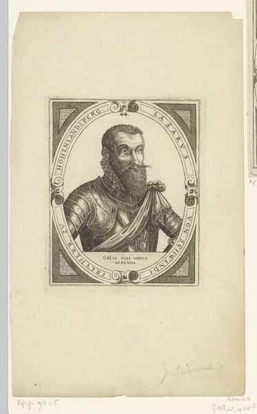
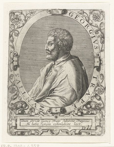
Editor: Here we have a print from the early 17th century, sometime between 1600 and 1604, titled "Portret van Georg baron van Frundsberg" by Dominicus Custos. It's an engraving and it's got such precise lines. How would you begin to analyze this portrait? Curator: Let us focus on the oval frame. Observe how it contains and compresses the figure, thereby heightening the intensity of the gaze. What effect do you think that has on the overall composition? Editor: It definitely keeps my attention on the face. The details in the face are incredible given the medium. Curator: Precisely. Consider how the engraving technique contributes to the representation of texture, notably in the baron's beard and the folds of his garment. This attention to textural detail enriches the visual experience, wouldn't you agree? How does that relate to the text inscribed around the perimeter? Editor: I do! The textures almost soften the formal tone created by the rigid, looping letters and Latin inscription, which I gather celebrates his virtues related to Mars or war? That softens the intensity, I think. Curator: Yes. And beyond subject matter, also notice how Custos uses light and shadow to sculpt the face, creating a strong sense of volume. This manipulation of chiaroscuro imbues the portrait with a dynamic quality, subtly activating the composition. Editor: So it's less about the literal story and more about the relationship between the lines, the shapes, the textures...how the artist manipulates those formal qualities? Curator: Indeed. The arrangement of visual elements generates meaning irrespective of external referents. Editor: That really helps me see engravings, and portraits in general, in a completely new light. There's more to unpack here than I initially thought!
Comments
No comments
Be the first to comment and join the conversation on the ultimate creative platform.
More like this