Dimensions: overall: 25.2 x 20.2 cm (9 15/16 x 7 15/16 in.)
Copyright: National Gallery of Art: CC0 1.0
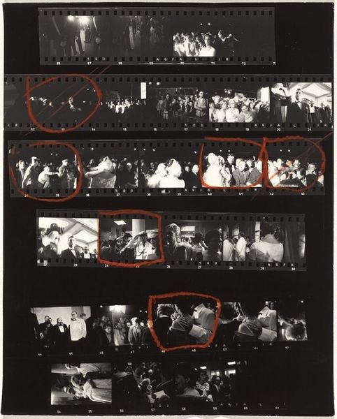
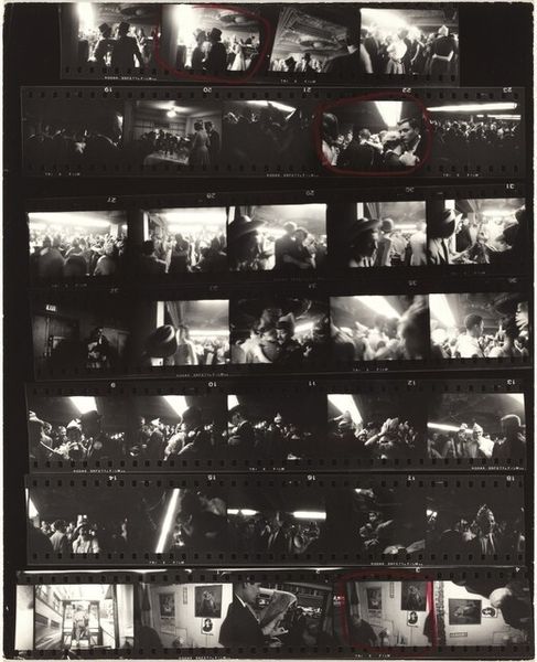
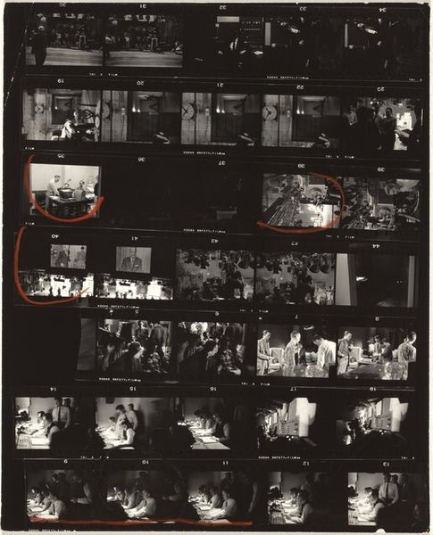
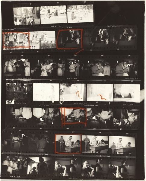
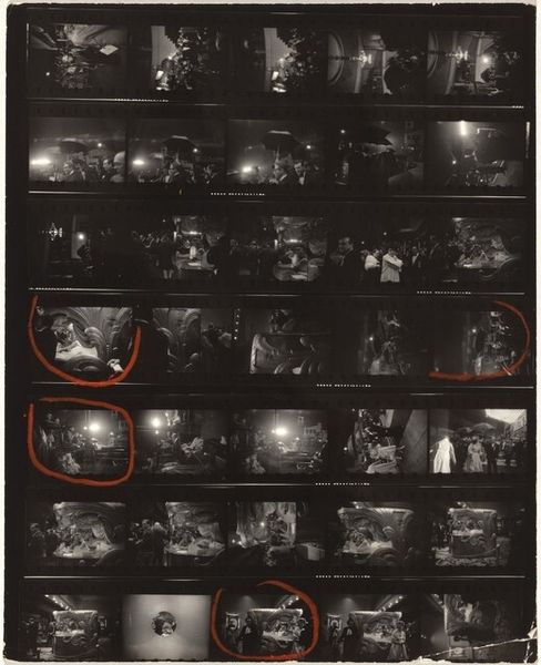
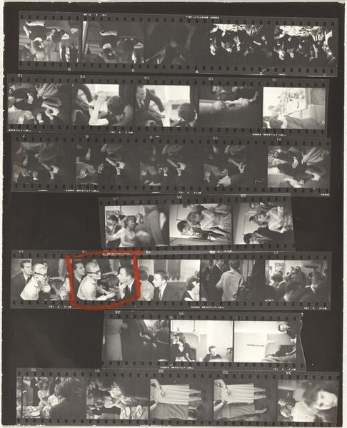
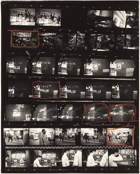
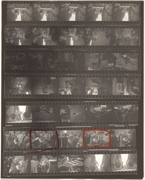
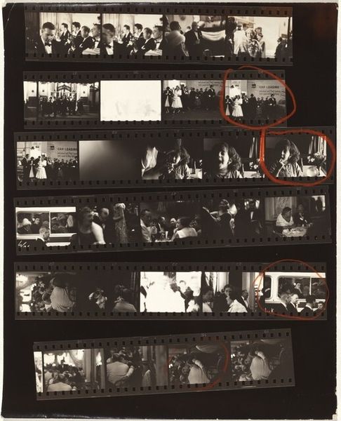
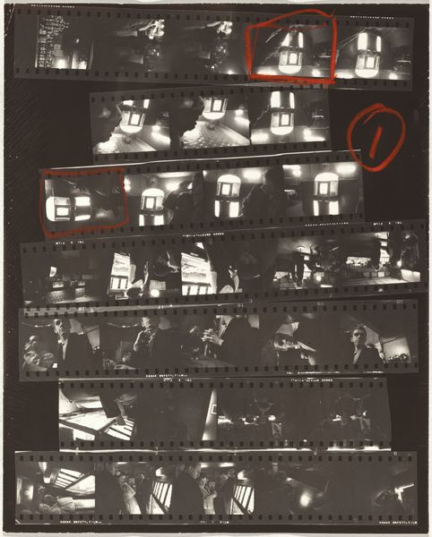
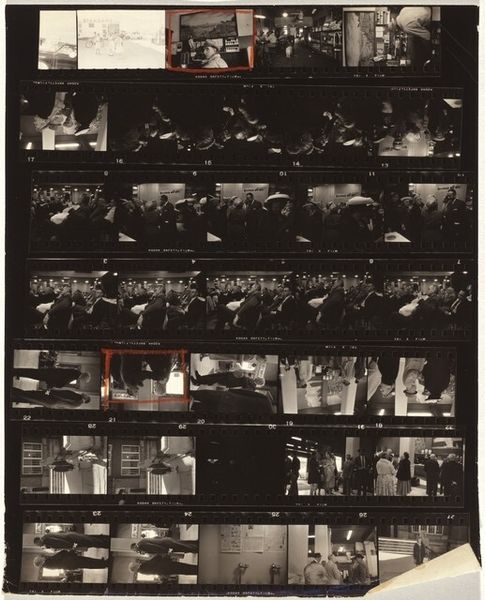
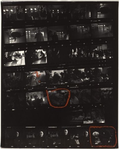
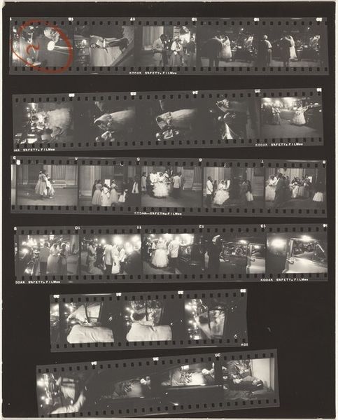
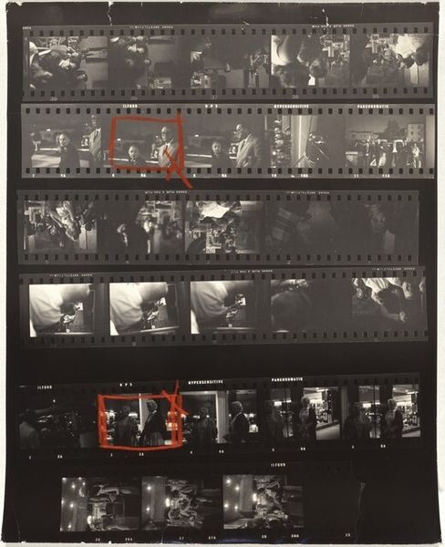
Editor: Robert Frank's "Venice, Italy 15" created in 1964, a gelatin-silver print, it feels fragmented and gives you an inside look to what he considers his best shots. I'm really curious about how he put it together. What do you see when you look at this piece, especially focusing on its composition? Curator: Initially, the very presentation strikes one—a contact sheet, marked up with what appear to be selection markings. Immediately, Frank disrupts the traditional expectation of a polished photograph, presenting the raw material of his artistic process. This draws attention to the act of selection itself, making it a core component of the work's meaning. Editor: That's interesting. So the process *is* the point in a way? What about the contrast of light? Curator: The stark contrasts in the black and white tones are particularly important. The high contrast heightens the sense of reality. Note, also, the relationship of forms created with high contrast, with some pictures circled in the photos with what looks like red crayon to accentuate particular ones. Why, I wonder? To contrast from its source imagery? What are your initial thoughts on how light operates to build space in the frames? Editor: It seems to separate subjects. By focusing on shapes and texture, it shows a hidden tension in a sea of similar images. Seeing this contact sheet with the circle markups makes me reconsider what it takes to finalize a photo, highlighting the choice that happens with every frame. Curator: Indeed, the artwork underscores the conscious choices an artist makes to arrive at a final composition. Editor: Right, and breaking it down this way gives me a new appreciation for both the single frame and its original environment of image.
Comments
No comments
Be the first to comment and join the conversation on the ultimate creative platform.
More like this