Dimensions: height 445 mm, width 291 mm
Copyright: Rijks Museum: Open Domain
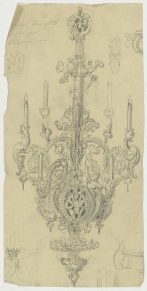
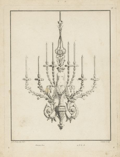
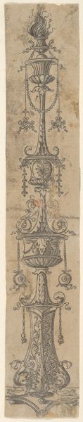
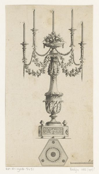
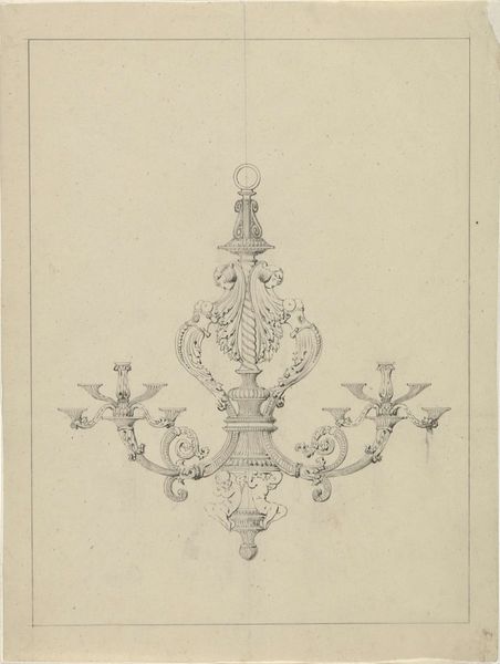
Editor: This is "Ontwerp voor een zilveren kroon," or "Design for a Silver Crown," created around 1763-1764 by Luigi Valadier. It's an ink and pen drawing, and its detail is incredible! All of those flourishes create such an ornate design. What draws your eye when you look at it? Curator: Immediately, it's the balance and symmetry that capture my attention. Notice how Valadier meticulously arranges each element around a central axis. The flanking candlesticks, the cherubic figures, and the cascading floral motifs create a harmonious visual rhythm. The ink line art and pen sketch, although delicate, work to reinforce a structural integrity. Do you perceive a hierarchy within the design's components? Editor: Yes, absolutely. The figure standing atop the central structure seems like the focal point, and the elements around it build up and out from there. Is that the key to the Baroque style? Curator: Indeed. The Baroque often uses elaborate ornamentation, but always within a structured framework. Here, the line weight varies to suggest depth and shadow. Examine how the ink and pen work, a play between positive and negative space. Does this push the artwork toward an immersive viewing experience? Editor: It definitely invites close inspection; seeing how the pen brings different parts of the artwork into focus based on the shading is exciting. Curator: Precisely. Valadier's technical mastery transforms what could have been mere ornamentation into a compelling structural statement, doesn't it? Editor: Yes, the formal elements create a really impressive sense of depth. Thanks for pointing that out! Curator: My pleasure! Analyzing form helps us decode meaning.
Comments
No comments
Be the first to comment and join the conversation on the ultimate creative platform.
More like this