lithograph, poster
#
art-nouveau
#
lithograph
#
pop art
#
figuration
#
cityscape
#
poster
Copyright: Public Domain: Artvee
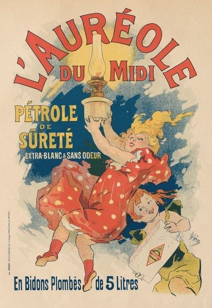
Editor: This vibrant poster, "Pantomimes Lumineuses," a lithograph by Jules Chéret from 1892, advertises a show at the Musée Grévin. I’m immediately struck by the dynamic contrast between the blue and red backgrounds, which really makes the yellow pop. What compositional elements stand out to you? Curator: The interplay of color fields is, indeed, a key formal strategy. Note how the upper register employs a cool, flat blue, in direct opposition to the lively red in the lower half. Consider the implications of this color division—how it affects the visual weight and directs the eye. Further, consider the deployment of figuration: The central female figure interrupts this rigid dichotomy. What do you observe in her pose? Editor: I notice that her dress merges a bit with both the red and blue. Her body seems to arch to the left, leading my eye toward the pierrot figure on the right side of her. Curator: Precisely. The sweeping curves of her posture create a visual link between the upper and lower portions of the image, serving to mitigate the potentially jarring division of color. Moreover, the positioning and gesture of the supporting figures subtly underscore the formal concerns that structure the work as a whole. What purpose do you think that this relationship provides? Editor: Well, it seems like it ties everything together—color, figures, and typography—creating a sense of unity rather than just a simple advertisement. Curator: I would concur that the visual coherence of the poster transcends mere promotional function, presenting a dynamic exploration of color, form, and figure-ground relationships. It calls for the show advertised to also include those same elements and invite you to ponder them further. Editor: This close examination really helped me appreciate how form itself communicates meaning. It’s more than just pretty colors! Curator: Agreed. Paying careful attention to the constituent elements can reveal sophisticated networks of signification often missed at first glance.
Comments
No comments
Be the first to comment and join the conversation on the ultimate creative platform.
More like this