drawing, paper
#
drawing
#
toned paper
#
script typography
#
hand-lettering
#
arts-&-crafts-movement
#
old engraving style
#
hand drawn type
#
hand lettering
#
paper
#
form
#
hand-drawn typeface
#
geometric
#
line
#
pen work
#
sketchbook art
#
small lettering
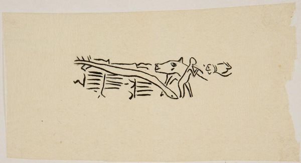
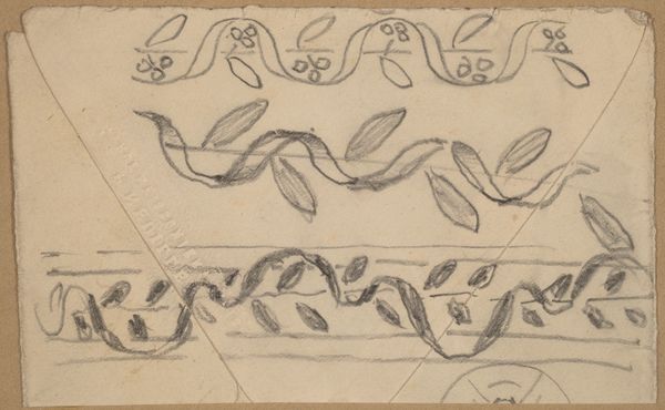
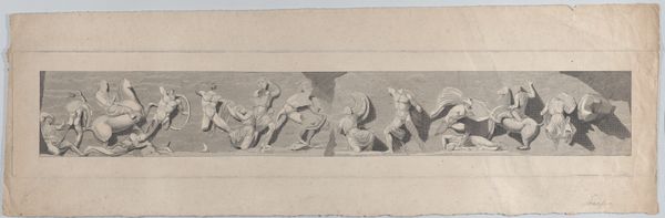
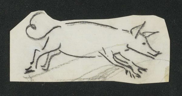
Dimensions: sheet (irregular): 2.8 × 8.4 cm (1 1/8 × 3 5/16 in.) mount: 29.9 × 45.6 cm (11 3/4 × 17 15/16 in.)
Copyright: National Gallery of Art: CC0 1.0
Curator: So, here we have Charles Sprague Pearce's "Study for a Border Design," dating from around 1890 to 1897. What strikes you first? Editor: Simplicity, I think. There's a raw, almost humble quality. It’s monochromatic, unassuming, but it suggests so much potential energy, doesn't it? Curator: Indeed. Pearce was, in a way, embracing the tenets of the Arts and Crafts movement here. It’s interesting because he was an academically trained artist, quite successful. This is so radically different from his polished salon paintings. Look at the formal elements. Editor: The repeating pattern, a kind of stylized, perhaps classical motif? It evokes borders I've seen in ancient Roman frescoes, doesn’t it? Leaves, maybe olives... and rendered with such confident, flowing lines. It has balance. The texture of the toned paper itself adds to the sense of antiquity. Curator: Absolutely. It’s deceptively simple. Each element, when viewed individually, is loose and free-flowing. Pearce plays with symmetry and asymmetry, giving it dynamism. It reminds me of finding beauty in everyday patterns, revealing the artistic essence in simple repetitions. Editor: You can see this becoming part of architecture, a design implemented in ceramic or metal. The beauty resides in the potential for functional elegance. You could endlessly reinterpret this concept. What was Pearce thinking here? Curator: Perhaps that beauty isn't about high ideals, or flawless representation but honest craftsmanship? He has caught the humble elegance of the olive branch, this idea of promise and hope, and that is why I am sure this simple “study” is timeless, despite its classical leanings. Editor: I find I'm captivated by the economy of line and form; such elemental visual language, which suggests how powerfully minimal design can speak. Curator: Right, so it proves that you can make profound points with light touches, which this "Border Design" is proof of!
Comments
No comments
Be the first to comment and join the conversation on the ultimate creative platform.
More like this